Preview image. Unlock full-res
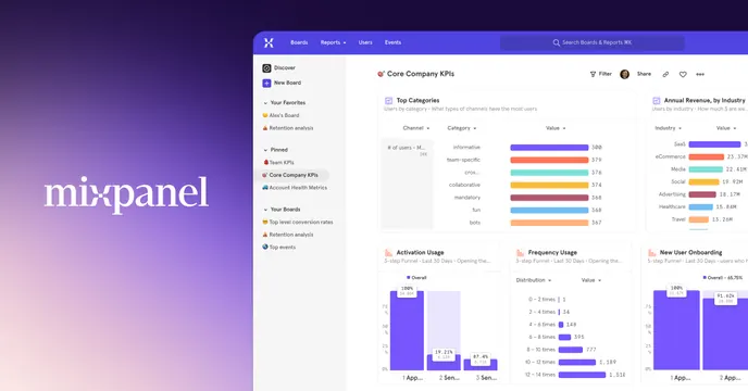
Split OG card with a white Mixpanel wordmark on a violet gradient panel beside a full analytics dashboard screenshot.
Summary
A split OG card pairing a large serif Mixpanel wordmark on a violet gradient block with a fully detailed product dashboard, selling the analytics tool by showing its interface.
Visual description
The left third is a purple gradient panel (deeper violet at the corners, lighter toward center) carrying the white Mixpanel wordmark set in a serif typeface, lowercase. The right two thirds is a high-fidelity screenshot of the Mixpanel app: a left nav rail with Discover, Boards, Favorites and Pinned items, and a main "Core Company KPIs" board filled with horizontal bar charts (Top Categories, Annual Revenue by Industry) and a lower row of column-chart cards (Activation Usage, Frequency Usage, New User Onboarding). The screenshot bleeds off the right and bottom edges. Tiny multi-color data bars add accent against the otherwise light, neutral UI.
Key takeaway
Anchoring a busy product screenshot with a single solid-color brand panel: the gradient block gives the wordmark room to breathe and stops the dense dashboard from overwhelming the card. Letting the UI bleed off two edges implies there is more product than the frame can hold.
Reuse notes
Strong pattern for analytics or data tooling where the interface itself is the selling point. Needs a genuinely attractive, legible dashboard; the charts read at thumbnail size only because the brand panel carries the identity. The serif wordmark over a vibrant gradient keeps it from feeling generic-SaaS.