Preview image. Unlock full-res
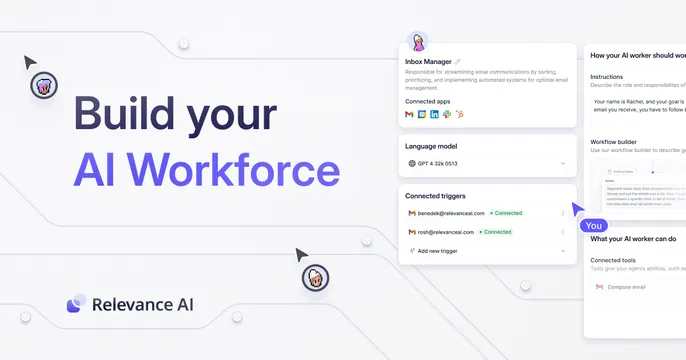
Light split OG card with a gradient "AI Workforce" headline on the left and a blurred product config UI on the right.
Summary
A soft, light split card pairing a two-line headline (with "AI Workforce" in a violet gradient) and the Relevance AI wordmark on the left against a faintly blurred agent-builder UI on the right. The gradient accent word carries the brand.
Visual description
On an off-white background, the left side holds "Build your" in dark sans-serif followed by "AI Workforce" rendered in a purple-to-blue gradient, with the Relevance AI logo and wordmark below. The right side shows a slightly blurred product screenshot: a panel labeled "Video Manager" with social icons, a "Language model" selector, "Connected triggers", and side panels for instructions and workflow setup. Small dotted directional arrows sit near the corners. The overall palette is pale and low-contrast.
Key takeaway
Reserving a single gradient for the one word that matters ("AI Workforce") while keeping everything else flat and dark. Softly blurring the supporting UI so it suggests product depth without competing with the headline.
Reuse notes
Fits an AI-agent or workflow-automation SaaS that wants a quiet, premium feel. The blur keeps the screenshot from stealing focus, useful when the UI is dense. Pairs well with pale brand palettes; the gradient word needs enough contrast to stay readable.