Preview image. Unlock full-res
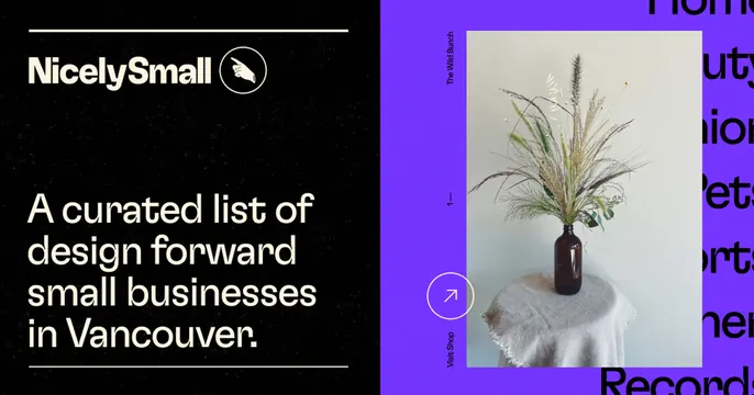
Split card with a black left panel holding the logo and a tagline, and a purple right panel showing a product photo over scrolling background type.
Summary
A two-panel card: a black left half with the NicelySmall logo and a large tagline, and a vivid purple right half framing a single product photo. The defining move is the hard split between an editorial text panel and a colorful image panel.
Visual description
The left half is matte black. At top, the NicelySmall wordmark sits beside a circular badge containing a pointing-hand icon. Below, a large cream sans-serif tagline reads "A curated list of design forward small businesses in Vancouver." over four lines, bracketed by thin horizontal rules top and bottom. The right half is saturated purple; a white-bordered photo of dried grasses in an amber bottle on a draped pedestal sits center, with thin vertical labels ("The Wild Bunch", "Visit Shop", a "1-" index) running up its edges. Oversized black words bleed in from the far right edge, partly cropped, suggesting a scrolling list behind.
Key takeaway
The black-versus-purple split that keeps the message and the product visually separate but balanced. The vertical micro-labels and the cropped marquee words on the right add an editorial, gallery-catalog texture without clutter.
Reuse notes
Good for a curated directory, shop, or marketplace that wants an arty, indie feel. The split lets you swap the right-hand product photo per share while keeping the left identity panel fixed. The bold accent color is doing a lot, so pick one that suits the brand.