Preview image. Unlock full-res
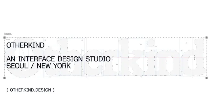
Swiss-style OG card with a faint construction-grid logo specimen behind tight all-caps studio info on white.
Summary
A studio's OG card that doubles as a logo-construction spec: a faint light-grey "Otherkind" wordmark rendered with blueprint guides sits behind small all-caps studio info at the left.
Visual description
White background with a wide, very light grey lowercase "Otherkind" logotype stretched across the full width, overlaid with thin blue and red construction guides, dashed contours, numbered callouts, and corner registration squares, like a type-specimen or brand-guideline page. At the upper left, in small black all-caps sans-serif, the name "OTHERKIND" sits above "AN INTERFACE DESIGN STUDIO / SEOUL / NEW YORK". Below the grid, again at left, a parenthetical "( OTHERKIND.DESIGN )" in the same compact caps. Everything is left-aligned and tightly set.
Key takeaway
Turning the logo's construction grid into the hero artwork. It signals craft and precision for a design studio while keeping the palette to pure white, black, and two faint registration colors.
Reuse notes
Ideal for design studios, type foundries, or technical/engineering brands that want a restrained, expert tone. The blueprint overlay reads best at large sizes; fine guides may get lost on small thumbnails. Works only on a clean light background.
More like this






Keep what you find
A free account saves references to boards and can send you a weekly email of picks based on what you save.
To see every result, go Pro.