
Preview image. Unlock full-res
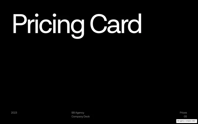
A 49-slide agency company deck in a strict Swiss grotesque system that alternates pure-black and pure-white slides with a single mint-teal accent and oversized lowercase headlines.
Summary
A 49-slide company deck for BB Agency (Balkan Bros.), a remote-first Croatian creative and engineering studio. Its personality is built on one disciplined system: pure-black and pure-white full-bleed slides traded back and forth, a single mint-teal accent, and oversized grotesque headlines, with tiny all-caps utility labels framing every page.
Visual description
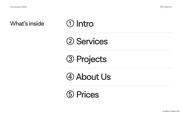
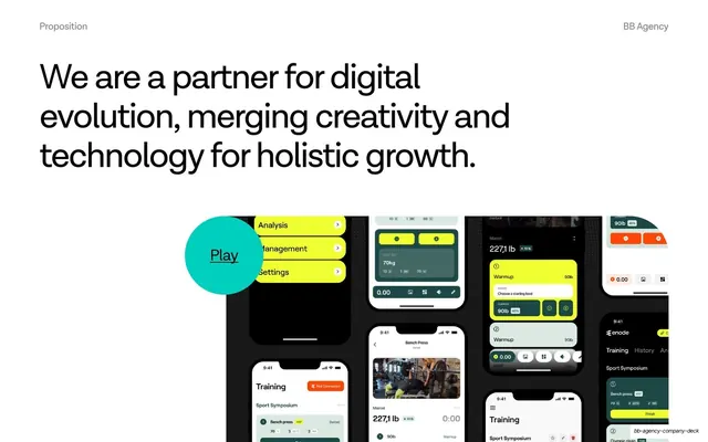
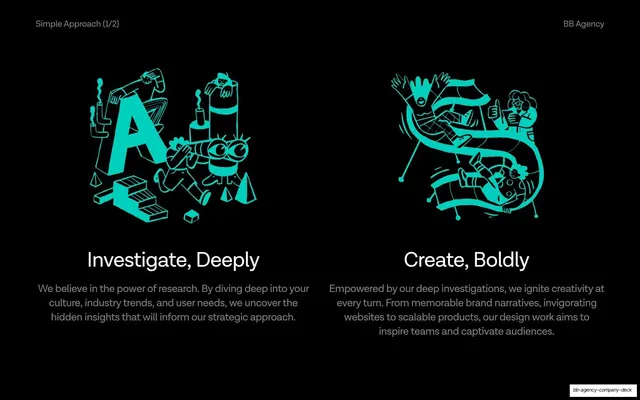
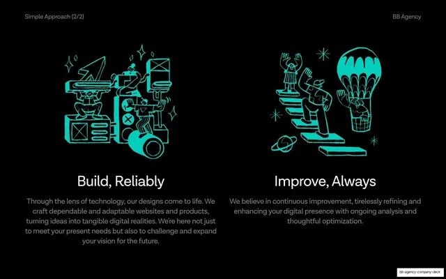
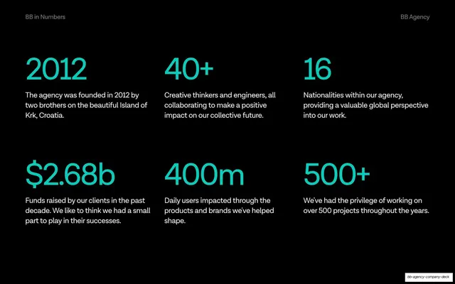
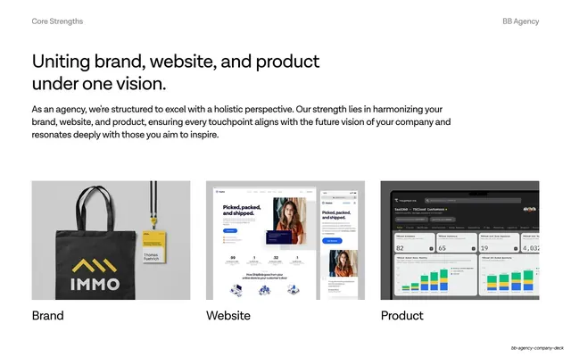
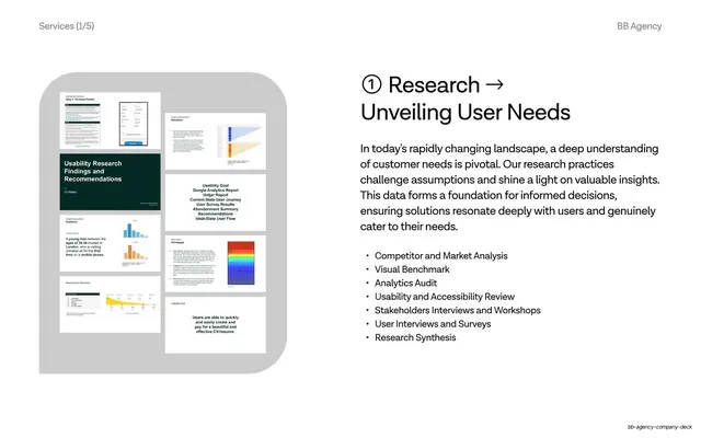
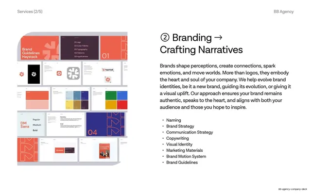
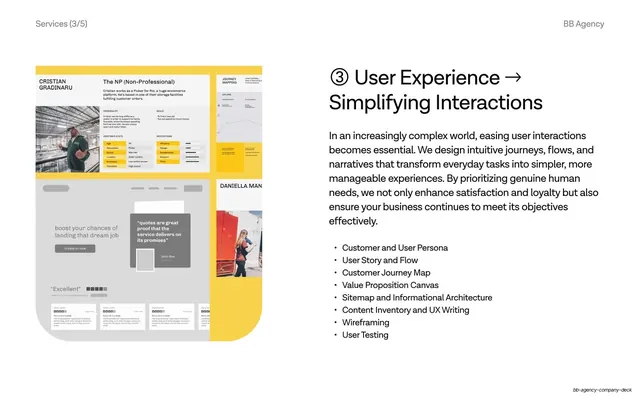
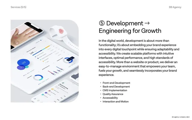
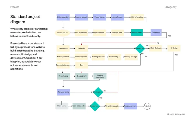
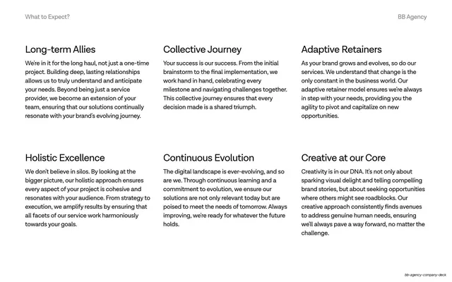
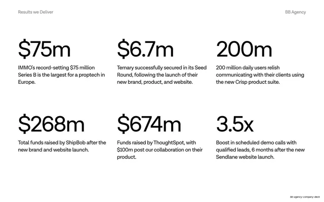
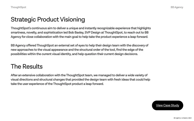
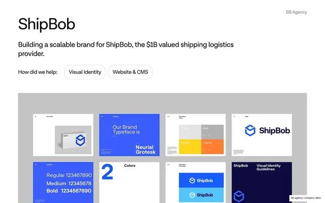
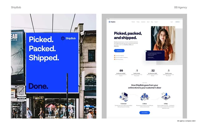
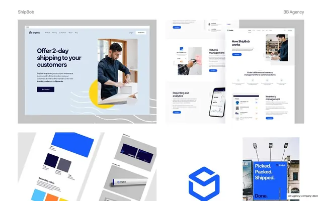
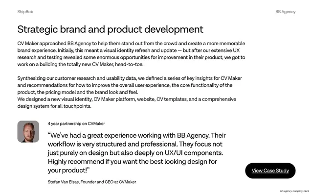
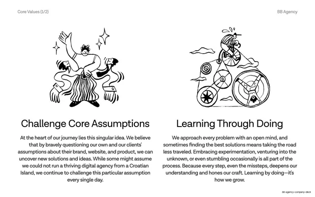
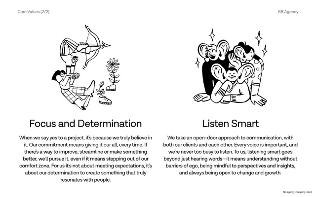
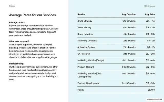
Slides run 16:9. The palette is reduced to three values: pure black (#000000), pure white (#FFFFFF), and one mint-teal accent (around #16E0C0) used for numbers, the second line of the cover title, line illustrations, and process highlights. Type is a clean geometric grotesque sans (Helvetica/Neue-Haas family), set very large for headlines that read sentence-case with no terminal punctuation, against small all-caps utility labels. A consistent running header sits on every content slide: the section name top-left (Proposition, Selected Clients, About Us, Services 1/5, Process, What to Expect), "BB Agency" top-right. Section-divider slides instead carry a three-part footer: "2023" left, "BB Agency / Company Deck" center, and the section name plus its two-digit number right. Recurring layouts: big-question divider slides on black ("Who are we?", "How can we help?"); centered manifesto statements; two-up paired panels with mint single-color line illustrations over black ("Investigate, Deeply" / "Create, Boldly"); a six-cell stat grid with oversized mint figures; a client logo wall in two rows; a three-card "Brand / Website / Product" image row; a repeated service-detail template (left column of small screenshot collage on a gray rounded card, right column with a circled number, an arrow headline, a justified paragraph and a bulleted capability list); a full-width flowchart process diagram; and multi-column text-only value grids.
Key takeaway
The three-value discipline: black, white, and one accent, nothing else, carried across nearly fifty slides without ever feeling thin. The alternating dark/light rhythm that paces a long deck purely through background flips. And the fixed service-detail template (circled number, arrow headline, paragraph, capability bullets, screenshot collage) that lets five services repeat with zero layout drift.
Reuse notes
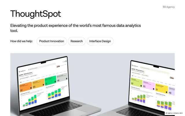
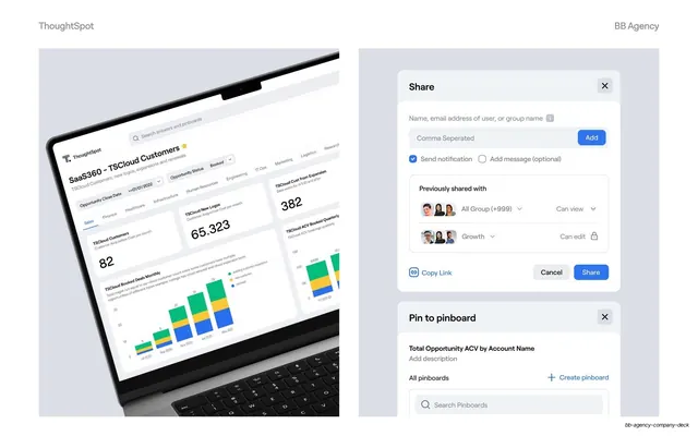
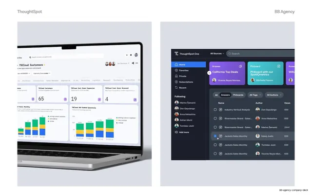
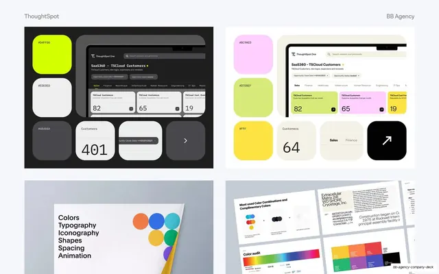
A strong reference for agency, studio, B2B service, or developer-tool company decks, and for any long deck that must stay legible and on-brand across 40-plus slides. The numbered service template and the two-up illustration panels are directly liftable. The mint line illustrations are bespoke; swap them for your own accent-color art. Needs genuinely good product screenshots and mockups to carry the case-study and service halves.
From this deck: BB Agency Company Deck
View deck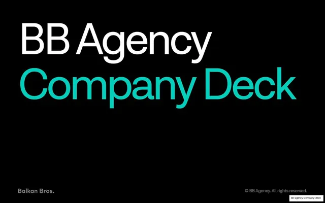


More like this







Keep what you find
A free account saves references to boards and can send you a weekly email of picks based on what you save.
To see every result, go Pro.