Preview image. Unlock full-res
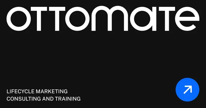
Dark minimal OG card with an oversized white geometric wordmark, lowercase descriptor at bottom-left, and a blue arrow chip.
Summary
A confident dark OG card built around one oversized white "ottomate" wordmark with a small service descriptor and a single blue arrow button anchoring the corners.
Visual description
Near-black background. The lowercase geometric "ottomate" logotype, set in a rounded monoline sans, runs nearly the full width across the top in white. The lower band is mostly empty negative space; at the bottom-left, small white all-caps reads "LIFECYCLE MARKETING / CONSULTING AND TRAINING". At the bottom-right a solid blue circle holds a white up-right diagonal arrow. The composition is asymmetric, balancing the heavy top wordmark against the small arrow chip.
Key takeaway
Letting one big geometric wordmark be the entire hero, then using generous empty space and a single accent chip to keep it from feeling bare. The blue arrow is the only color, so it reads instantly as the action cue.
Reuse notes
Great for agencies, consultancies, or B2B service brands with a strong logotype and a minimalist brand. Depends on a wordmark distinctive enough to carry the card alone. The lower-left descriptor is small, so keep the key word inside the logo.
More like this




Keep what you find
A free account saves references to boards and can send you a weekly email of picks based on what you save.
To see every result, go Pro.