Preview image. Unlock full-res
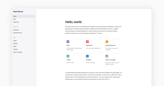
Light card showing a clean personal-portfolio dashboard UI with a left sidebar nav and a "Hello, world." intro plus colorful link tiles.
Summary
A light card that is essentially a screenshot of a personal-portfolio web app: a left sidebar of navigation links beside a "Hello, world." intro paragraph and a grid of colorful icon link tiles. Showing the actual portfolio interface as the card is the defining move.
Visual description
The frame is a soft light-gray with a rounded white app panel taking most of the space. A narrow left sidebar headed "Paul Faivret" lists nav items in groups: Home, Work (5), Playground (9) under no header; Bookmarks (11), Figma Resources (3) under "Resources"; Twitter, Dribbble, Figma, Linkedin, Leave a message under "Social," each social row carrying a small up-right arrow. The main column opens with a bold "Hello, world." heading, a short gray bio paragraph about being a multidisciplinary designer in London, then a two-row grid of square tiles each with a rounded colored app icon (purple Work, red Bookmarks, orange Figma Resources, green Twitter, blue Dribbble, gray Leave a message) and a small label plus one-line description. A second paragraph of bio text sits below, partly cut by the frame.
Key takeaway
Using a faithful crop of your real product or portfolio UI as the share image, so the card itself demonstrates the craft. The sidebar-plus-tile dashboard layout reads as organized and personable, and counts next to nav items hint at depth of content.
Reuse notes
Best for designers, developers, or product folk whose portfolio interface is itself a selling point, or for app products that look good in a clean dashboard state. Requires a genuinely tidy UI and good light balance. Small body text will be unreadable at thumbnail size, so the structure and the "Hello, world." headline carry the impression.