Preview image. Unlock full-res
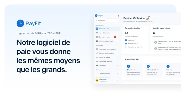
Light split card with the PayFit logo and a bold dark French headline on the left and a large floating product dashboard screenshot on the right.
Summary
A clean light card split into a left text block (PayFit logo, subtitle, and a bold navy French headline) and a right side filled by a large floating screenshot of the payroll dashboard. Pairing brand copy with a generous product screenshot is the defining move.
Visual description
The background is a pale blue-white. Top-left sits the round blue PayFit logo mark with the "PayFit" wordmark, then a small gray subtitle "Logiciel de paie & RH pour TPE et PME," then a large left-aligned navy headline "Notre logiciel de paie vous donne les mêmes moyens que les grands." The right portion shows a soft-shadowed product screenshot of the app: a left menu in French (Tableau de bord, Mes collaborateurs, Demandes a valider with a red 26 badge, etc.), a "Bonjour Catherine" greeting, stat tiles ("Demandes a valider 26," "Vos taches en attente 6"), notification rows, and a "Vos acces rapides" row of blue-icon cards. The screenshot is cropped by the right edge so it floats into frame.
Key takeaway
Anchoring the left with a tidy logo-subtitle-headline stack and letting a real, populated product dashboard fill the right at large scale. Showing actual filled-in data (names, counts, badges) makes the software feel real and in use.
Reuse notes
Strong default for B2B SaaS, HR, or fintech tools whose dashboard is the product. Works on a light tinted ground with a single brand accent color. Keep the headline column narrow so the screenshot gets room; the cropped screenshot edge is intentional. Localize copy as needed, but the structure carries regardless of language.