Preview image. Unlock full-res
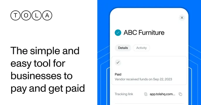
Split card with a circled-letter logo and bold value headline on white, beside a blue panel holding a payment-status app mockup.
Summary
A clean fintech card split into a white messaging half and a bright-blue product half. The defining move is the value line "The simple and easy tool for businesses to pay and get paid" set large beside a tidy payment-confirmation mockup.
Visual description
The left half is white, carrying a "TOLA" logo built from four outlined circles each holding one letter, and beneath it a large black headline: "The simple and easy tool for businesses to pay and get paid." The right half is a vivid blue panel with faint line-art arches, on which a white app card floats showing an "ABC Furniture" payment marked Paid ("Vendor received funds on Sep 22, 2023"), with Details / Activity tabs and a tracking link row. The two halves meet on a hard vertical edge.
Key takeaway
The crisp white-copy / colored-product split, with the headline stating the job and the floating UI card proving it. The circled-letter logo is a distinctive, ownable mark. Setting the mockup on a saturated brand-blue panel makes the white product card pop.
Reuse notes
A dependable layout for fintech, payments, and B2B SaaS that want a plain-spoken benefit plus product proof. Needs a focused, legible UI snippet (here a single payment confirmation) rather than a dense screen. The hard split keeps copy and product from competing.