Preview image. Unlock full-res
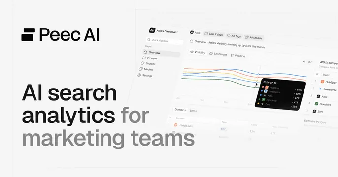
Light split OG card with a stacked two-tone headline and wordmark on the left and an analytics dashboard screenshot bleeding off the right.
Summary
A light, two-panel OG card with a stacked two-tone headline on the left and an analytics dashboard screenshot bleeding off the right edge. The defining move is the black-and-grey headline emphasis paired with a real product surface.
Visual description
On a very light grey background, the left half holds the "Peec AI" wordmark and logomark at top-left, then a four-line headline "AI search analytics for marketing teams" where "AI search analytics" and "marketing teams" are near-black and "for" is grey, all in oversized sans-serif. The right half shows a light-themed analytics dashboard tilted slightly and bleeding off the right and bottom edges: a left nav (Overview, Prompts, Sources, Models, Settings), a multi-line trend chart with a dark tooltip card listing competitor visibility percentages (HubSpot 65%, Salesforce 62%, Attio 47%, Pipedrive 41%, Zero 28%), filter pills, and a domains table below. Faint corner crop-mark lines frame the canvas.
Key takeaway
The two-tone headline that bolds the value words and greys the connectors for emphasis without color. Letting a detailed dashboard bleed off-canvas so it implies a fuller product without needing a frame. Faint corner ticks that lend a precise, blueprint feel.
Reuse notes
Strong for an analytics or martech SaaS that wants to show data in the card. Needs a clean, legible dashboard since it carries the right half. Light canvas keeps it approachable; the dense chart can lose detail at thumbnail size, so the headline must stand alone.