Preview image. Unlock full-res
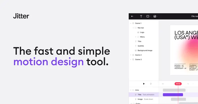
Light-grey OG card with a left headline that color-highlights two words and a tilted motion-editor UI on the right.
Summary
A light-grey OG card split between a left headline that color-highlights its key phrase and a motion-design editor screenshot bleeding off the right edge.
Visual description
The background is a soft light grey. The black "Jitter" wordmark sits upper-left, with a two-line headline below in heavy black sans-serif ("The fast and simple motion design tool.") where the words "motion design" are colored bright violet for emphasis. The right side shows the Jitter editor UI: a dark toolbar with text/shape/image tools, a layers tree (Scene 1 with Nav bar, Title, Subtitle, Background image), a canvas previewing a "LOS ANGELES (USA*) WEATHER" poster with a pink-orange gradient, and a bottom timeline with a red "00:60" playhead and animation tracks. The screenshot runs off the right edge.
Key takeaway
Color-highlighting only the two words that name the category ("motion design") inside an otherwise monochrome headline. Pairing it with a real editor screenshot, including a visible timeline that signals the motion/animation purpose.
Reuse notes
Good for a creative or editor tool where showing the actual workspace is the strongest proof. The visible timeline/playhead is a clean way to hint at motion in a still. Keep the accent color tied to the brand so the highlighted words feel intentional.