Preview image. Unlock full-res
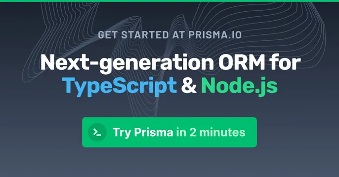
Dark gradient developer OG card with a centered headline, color-coded keywords, and a green CTA button.
Summary
A centered dark-gradient card for a developer ORM, leading with a bold headline whose tech keywords are color-coded, anchored by a green pill CTA.
Visual description
A navy-to-slate gradient background carries faint topographic contour lines drifting across the upper-left, plus a thin green accent bar pinned along the very top edge. Centered content stacks vertically: a small grey uppercase eyebrow "GET STARTED AT PRISMA.IO", then a large white headline "Next-generation ORM for" with the second line reading "TypeScript" in blue and "Node.js" in green. Below sits a rounded green button labeled "Try Prisma in 2 minutes" with a small terminal-prompt icon. Type is a sturdy sans; the only color comes from the two highlighted keywords and the green button.
Key takeaway
Color-coding the technology names inside the headline so the audience and stack register in a glance. The single green pill CTA gives a static social card the feel of a live landing hero.
Reuse notes
Ideal for a developer tool or framework that targets a specific stack. The subtle topographic texture keeps a dark card from going flat without competing with the type. Pin the brand accent color as both the top bar and the button to tie the card together; only works on dark.