Preview image. Unlock full-res
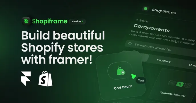
Dark green OG card with a logo lockup, version badge, three-line headline and a perspective collage of green-tinted builder UI panels.
Summary
A dark green OG card leading with a logo-plus-version-badge lockup and a punchy three-line headline, set against angled, green-tinted screenshots of the product's component builder. The glowing UI collage signals "design tool" instantly.
Visual description
Deep green-to-black gradient background. Top left: a rounded app icon and "Shopiframe" wordmark in green and white, with a small pill badge reading "Version 2." Below, an oversized white three-line headline "Build beautiful / Shopify stores / with framer!" followed by the Framer and Shopify glyphs in a row. The right two-thirds is a perspective-tilted collage of frosted, semi-transparent UI panels (a "Components" search panel, "Cart Count" and "Quantity Selector" cards) glowing in green over the dark field.
Key takeaway
The version badge next to the wordmark is a smart, specific detail that signals a maturing product. Tilting translucent UI cards in perspective with a green glow turns plain screenshots into atmospheric depth.
Reuse notes
Well suited to a plugin, template, or builder product that lives inside another platform (here Framer plus Shopify). The angled glassy panels need a real, clean UI to fan out; the dark-green glow only reads on a dark base.