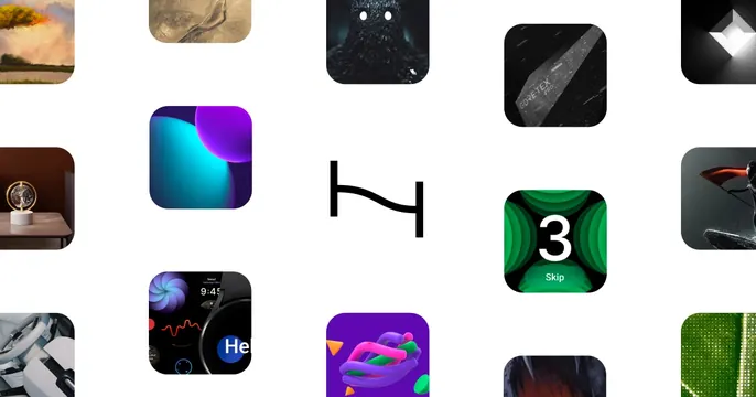
Preview image. Unlock full-res
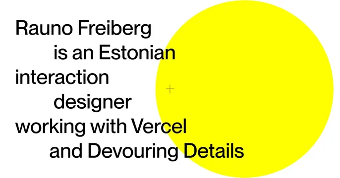
Minimal white OG card with a left-aligned indented bio sentence in plain black sans-serif overlapping a large flat yellow circle on the right.
Summary
A spare white personal card where a self-describing sentence is set in staggered, indented lines of plain black type, overlapping a single large flat yellow disc.
Visual description
White background. On the left, a multi-line sentence in medium-weight black sans-serif reads "Rauno Freiberg is an Estonian interaction designer working with Vercel and Devouring Details", with alternating lines indented so the text steps in and out rather than aligning flush left. On the right, a large solid yellow circle bleeds off the top and right edges; a small thin grey plus mark sits near its left edge, hinting at a registration or alignment cue. No logo or product UI appears.
Key takeaway
Letting the entire card be one honest bio sentence, given rhythm through staggered indentation, with a single saturated geometric shape as the only graphic. It feels considered and design-literate while staying almost contentless.
Reuse notes
Ideal for a designer, engineer, or studio personal site that wants an understated but distinctive social card. The staggered typesetting and lone yellow disc do the work; swap the shape's color to re-skin. Best when the bio sentence is genuinely interesting on its own.