Preview image. Unlock full-res
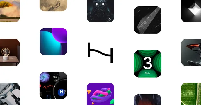
A grid of rounded app-icon thumbnails on white with a single black logo glyph centered among them.
Summary
A portfolio card built as a loose grid of rounded-square thumbnails, app icons, 3D renders and UI shots, on white, with a single black logo glyph sitting centered among the tiles. The gallery-of-work layout is the move.
Visual description
A white field holds a sparse, evenly spaced grid of rounded-corner thumbnails bleeding off all four edges: a painterly landscape, a dark monster render, a Gore-Tex product shot, colorful gradient orbs, a smartwatch UI, a green "3 / Skip" interface, a desk-lamp photo, abstract 3D shapes and more. Dead center, where a tile would be, floats a small black abstract logo mark instead of an icon, becoming the focal point. No headline, tagline, or URL.
Key takeaway
Turning a portfolio into one OG card by tiling many work thumbnails and reserving the center cell for the maker's logo, so the brand sits literally inside the body of work. The white gutters keep a dense grid feeling calm and premium.
Reuse notes
Strong for a designer, studio, or app-maker with a visually varied portfolio. Needs enough high-quality, diverse thumbnails to fill the grid attractively. At small sizes individual tiles get tiny, so the overall mosaic impression has to carry it.