Preview image. Unlock full-res
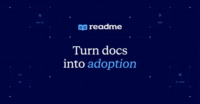
Deep navy OG card centering the readme logo and a serif headline Turn docs into adoption, framed by four labeled feature node tiles in the corners over a blueprint grid.
Summary
A navy developer-docs card with a centered logo and serif headline, ringed by four labeled feature node tiles on a faint blueprint grid that frames the message like a circuit.
Visual description
Deep navy-blue background overlaid with a faint blueprint grid and small node dots. Centered near the top sit the readme book icon and wordmark; below, a serif headline reads "Turn docs into adoption", with the word "adoption" set in a lighter blue italic for emphasis. In the four corners are rounded outlined tiles, each with a small line icon and an all-caps label: SYNC GIT, AGENT, API and AI LINTER, connected to the center by thin grid lines and small square nodes, so the layout reads as a schematic surrounding the headline.
Key takeaway
Using corner feature-tiles wired into a central message via a blueprint grid, turning a simple logo-plus-headline card into a mini system diagram that hints at capabilities without a paragraph of copy. The single italic accent word adds editorial warmth to a technical palette.
Reuse notes
A fit for a developer or docs platform that wants to imply breadth of features on one card. The corner-node framing needs short, real feature labels and clean icons; the serif headline keeps a deep-navy technical card from feeling cold.