Preview image. Unlock full-res
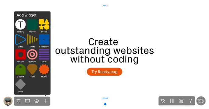
Light OG card framed as the product editor, with a dark widget-picker panel at left and a centered headline plus orange CTA button.
Summary
A card staged as the product's own canvas, with the widget-picker panel anchored at left and a centered no-code headline beside an orange call to action.
Visual description
On a plain white canvas, a dark rounded "Add widget" panel sits at the left, holding a grid of colorful widget icons with labels: Text (T), Picture, Shape, Video, Shots, Slideshow, Button, Hotspot, Form, E-comm, Maps, Music and Code. To the right of center, a dark headline in a soft display face reads "Create outstanding websites without coding" over three lines, with an orange pill button beneath it labeled "Try Readymag." Editor chrome frames the scene: a small round user avatar and a toolbar at the bottom-left, faint zoom percentages ("144%", "2,286") with a blue diamond marker at top and bottom center, and a cursor/tool toolbar with a help icon and a preview eye at the bottom-right.
Key takeaway
Presenting the OG card as if it were the live editor canvas, complete with the widget palette and toolbars, shows the tool in use without a literal full screenshot. The single orange CTA pill gives a clear action and the only strong color.
Reuse notes
Great for a no-code builder or visual editor where the toolset is the selling point. The colorful widget icons carry the personality, so keep the rest white and quiet. Embedding fake editor chrome (zoom, cursors, avatar) sells the "inside the app" feel; keep those details subtle so the headline and CTA stay primary.
More like this


Keep what you find
A free account saves references to boards and can send you a weekly email of picks based on what you save.
To see every result, go Pro.