Preview image. Unlock full-res
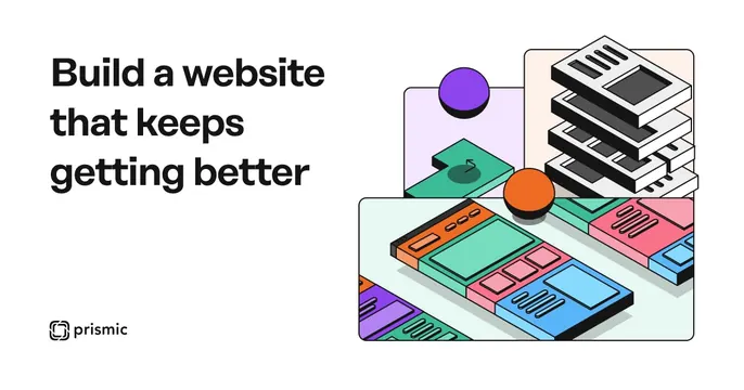
Left-aligned OG card with a short dark headline and a colorful isometric illustration of stacked website blocks on a light ground.
Summary
A left-aligned card that balances a terse three-line headline against a playful isometric illustration of website page-blocks being assembled.
Visual description
On an off-white background, a dark near-black sans-serif headline sits top-left reading "Build a website that keeps getting better" across three lines, with a small Prismic logo mark and wordmark beneath it at the bottom-left. The right two-thirds is filled with a colorful line-art isometric illustration: stacked and tilted website-page panels in teal, coral, lavender and white, suggesting modular content blocks and slices, accented by a purple sphere and an orange dot floating above. The illustration style is flat with thin outlines.
Key takeaway
The isometric "exploded page blocks" metaphor instantly communicates a modular website builder without a literal screenshot. Pairing flat illustration with one or two bright accent spheres adds energy to an otherwise restrained layout.
Reuse notes
Best for a developer or website tool whose product is structural rather than visual. The headline must stay short to hold the left third; this captured card is small, so keep type weight high. Lean on the brand's illustration system to keep the colorful blocks on-brand.
More like this
Keep what you find
A free account saves references to boards and can send you a weekly email of picks based on what you save.
To see every result, go Pro.