Preview image. Unlock full-res
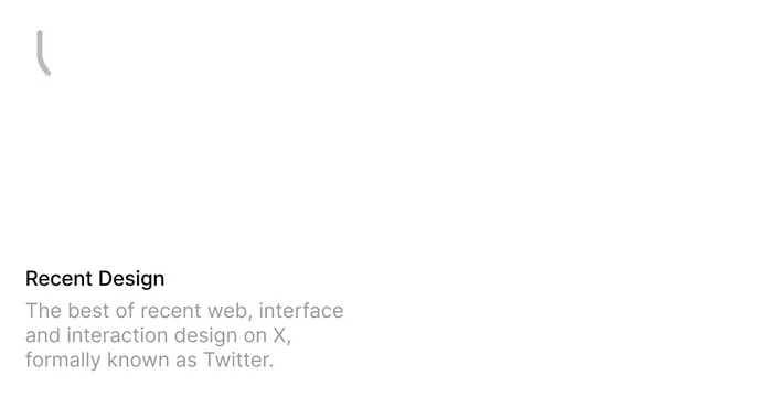
Near-empty white OG card with a small grey quotation-mark glyph top-left and a bottom-left title plus muted three-line description about recent web and interface design.
Summary
A mostly empty white card with a single small grey quote glyph in the top-left and a quiet title-and-description block anchored to the bottom-left corner.
Visual description
White background with vast empty space. In the top-left sits a small light-grey curved glyph reading as a single quotation mark. The only other content is anchored to the bottom-left: a small black title "Recent Design" above a muted grey three-line description, "The best of recent web, interface and interaction design on X, formally known as Twitter." Everything is left-aligned, low-contrast, and restrained; there is no product image, logo lockup, or color.
Key takeaway
Pinning a small title-and-description block to the bottom corner and leaving the rest of the card empty, which reads as a calm, editorial, curation-led identity. The single faint quote glyph is the only flourish and keeps it from feeling blank by accident.
Reuse notes
Fits a newsletter, link-curation, or editorial project with a quiet, knowing tone. The heavy emptiness can look like a cropped or unfinished capture, so it works best when the bottom text and the minimal aesthetic clearly signal intent.
More like this

Keep what you find
A free account saves references to boards and can send you a weekly email of picks based on what you save.
To see every result, go Pro.