Preview image. Unlock full-res
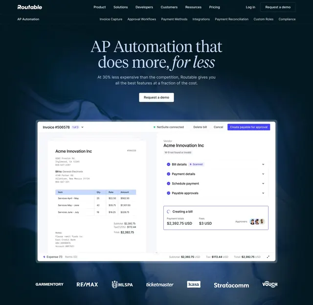
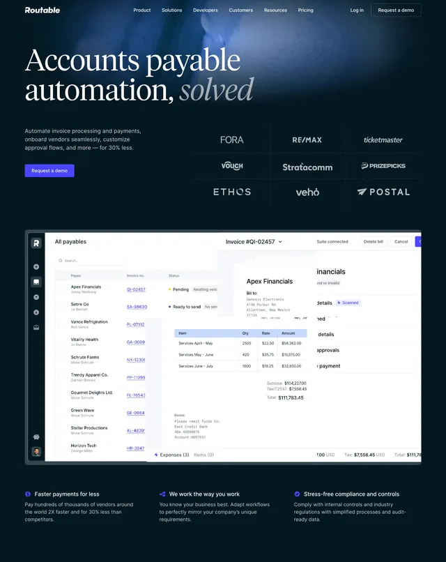
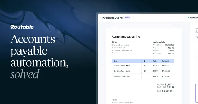
Dark-navy split OG card with a white serif-italic accented headline on the left and a bright invoice UI screenshot on the right.
Summary
A dark-navy split card with a white headline (its last word in serif italic) on the left and a crisp invoice-management screenshot bleeding off the right. The serif-italic accent word against an AP product shot defines it.
Visual description
The left side is a deep navy field with a faint wave texture, carrying the white Routable wordmark and the three-line headline "Accounts payable automation," with the word "solved" set in a contrasting white serif italic. The right side shows a bright white product screenshot of an invoice view: "Invoice #506578" for "Acme Innovation Inc" with bill-to details, an itemized line-item table (Qty, Rate, Amount), subtotal and total figures, and a NetSuite sync badge, cropped off the right edge.
Key takeaway
Switching the final headline word to a serif italic for an elegant emphasis against an otherwise plain sans headline. Pairing a calm dark text panel with a clean, data-rich invoice screenshot to signal trust in a finance product.
Reuse notes
Strong for a fintech, AP, or billing SaaS that wants to look both polished and precise. The serif-italic accent needs a typeface pairing that feels intentional. The dark-panel-with-light-UI split works well; keep the screenshot legible.