Preview image. Unlock full-res
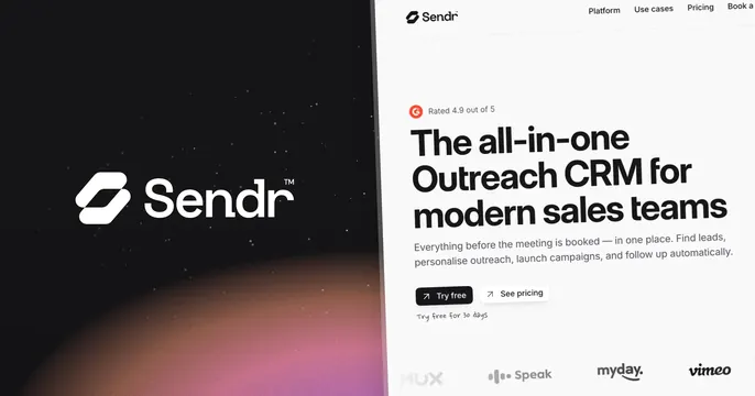
Split OG card with a glowing dark logo panel on the left and a bright product landing-page screenshot on the right.
Summary
A two-panel OG card that contrasts a dark, glowing logo lockup on the left with a full bright product landing page on the right.
Visual description
The left panel is near-black with a faint starfield and a warm pink-to-orange gradient glow rising from the bottom; it holds a large white Sendr logo and wordmark with a trademark mark. The right panel is a light website screenshot: a top nav reading "Platform / Use cases / Pricing / Book a", a small "G2 Rated 4.9 out of 5" mark, then an oversized bold dark headline, "The all-in-one Outreach CRM for modern sales teams", a line of sub-copy, dark "Try free" and outlined "See pricing" buttons, a handwritten "Try free for 30 days" note, and a bottom logo wall (MUX, Speak, myday, vimeo).
Key takeaway
The dark-versus-light split lets the brand mark breathe on one side while the other side delivers the full pitch, headline, rating, CTAs and customer logos, in one frame. The warm gradient glow keeps the logo panel from feeling flat.
Reuse notes
Note this capture looks taller than a standard 1200x630 card, so the live OG crop may differ; treat the layout, not the framing, as the reference. Good when you want both brand presence and a complete proof-laden hero. Keep the right-side text large since it carries a lot of detail.