Preview image. Unlock full-res
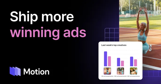
Split dark OG card with a two-tone headline and logo on the left and a sports photo plus a floating creative-performance chart card on the right.
Summary
A split dark-navy Motion card pairing a bold two-tone headline and logo on the left with a sports lifestyle photo and a floating "top creatives" chart card on the right.
Visual description
Deep navy-to-black background. The left half carries the headline "Ship more winning ads" where "Ship more" is white and "winning ads" shifts to a pink-to-magenta gradient, set oversized in two lines; the Motion logo (overlapping rounded squares) and wordmark sit at bottom-left. The right half shows a photograph of an athlete stretching on a running track in teal activewear, partly overlaid by a white floating UI card titled "Last week's top creatives" containing a grouped purple-and-pink bar chart and three small video-creative thumbnails labeled with filenames. Subtle violet grid graphics bridge the two halves.
Key takeaway
The two-tone headline (white plus a gradient on the key phrase) cleanly separates context from value proposition in one line. Overlapping a real product UI card onto a lifestyle photo connects the abstract analytics to the creative work it measures, making a B2B tool feel vivid.
Reuse notes
Well suited to marketing, ad-analytics, or creative-ops platforms that benefit from showing both human imagery and product data. The split needs a photo that matches the customer's world; the floating UI card must stay legible over the image. Built for dark backgrounds with one gradient accent.