Preview image. Unlock full-res
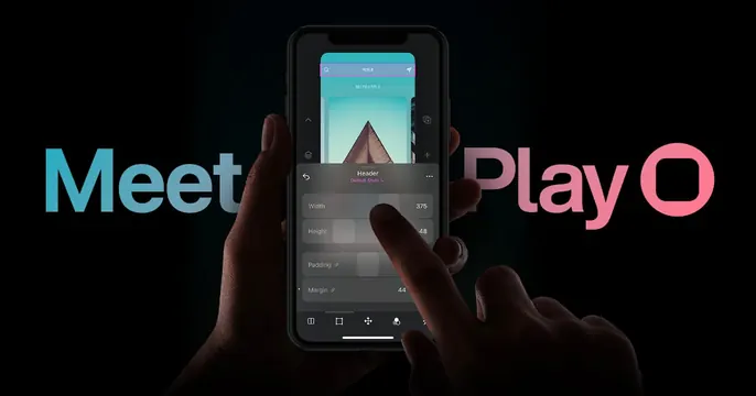
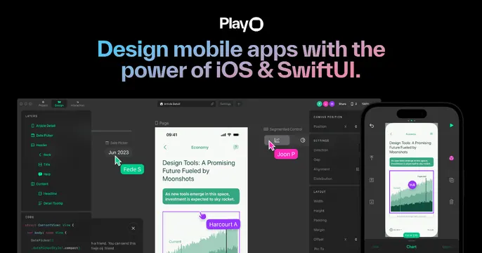
Black card with the PlayO wordmark over a cyan-to-pink headline about iOS and SwiftUI, above a wide design-app screenshot.
Summary
A dark PlayO OG card leading with a gradient headline about designing with iOS and SwiftUI, anchored by a wide screenshot of the app's editor and a phone preview.
Visual description
Near-black background. At top, the white "PlayO" wordmark sits above a two-line headline, "Design mobile apps with the power of iOS & SwiftUI.", filled with a left-to-right cyan-to-pink gradient in a heavy sans. The lower half is a wide product screenshot: the Play editor with a left layers panel, a center artboard showing an "Economy" article screen, a right inspector listing Direction, Gap, Alignment, Width and Height, plus a phone preview at far right and a code snippet at bottom-left. Colored collaboration name-tags ("Joon P", "Fede S", "Harcourt A") float over the canvas.
Key takeaway
The stacked formula of wordmark, gradient value-prop headline, then a generous product screenshot showing the editor's full chrome. The multiplayer name-tags signal real-time collaboration at a glance.
Reuse notes
Well suited to a design or no-code tool that wants to prove depth by showing the whole working interface. The screenshot needs enough resolution to read panel labels. The cyan-to-pink gradient and dark field tie it to a creative-tech identity.