Preview image. Unlock full-res
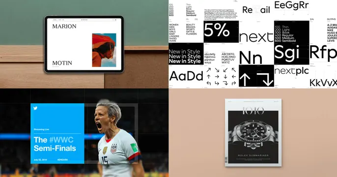
A four-quadrant grid of agency portfolio work, an iPad website, a typographic brand system, a blue sports streaming graphic, and a dark watch magazine cover.
Summary
A 2x2 portfolio collage with no headline: four distinct pieces of agency work, an iPad showing a minimal fashion site, a black-and-white type-specimen system, a blue "WWC Semi-Finals" streaming graphic with a footballer, and a dark watch-magazine spread, tiled edge to edge.
Visual description
The card is split into four equal quadrants. Top-left: an iPad mounted on a wood-and-green wall displaying a clean "MARION MOTIN" editorial website with a small red-toned image. Top-right: a dense black-and-white typographic brand system grid showing weights, glyphs, and "next" wordmarks. Bottom-left: a vivid blue panel reading "The #WWC Semi-Finals" with a Twitter bird and a shouting USA footballer in a stadium. Bottom-right: a warm taupe set with a dark, premium magazine cover for a "Rolex Submariner" watch feature. Each tile is a different project with its own palette; there is no overlaid title or logo.
Key takeaway
Letting a tidy four-up grid of real project thumbnails speak for itself is a strong move for an agency or portfolio, the range of work IS the message. The quadrants vary in color and medium yet stay balanced through equal sizing and consistent crop discipline.
Reuse notes
Use when you have four genuinely strong, visually varied case studies and want breadth over a single hero. No headline means it relies on the work to communicate, so pair the card with a clear page title or wordmark elsewhere. Choose pieces that differ in color so the grid does not blur together.