Preview image. Unlock full-res
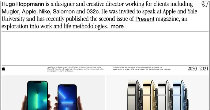
Editorial portfolio card led by a serif bio paragraph with underlined client names, above a project case-study strip of iPhone photography.
Summary
An editorial portfolio card built like a magazine page: a large serif bio paragraph with underlined client names up top, then a project strip showing iPhone product photography with annotation copy and a year dateline.
Visual description
A white background opens with a multi-line serif paragraph reading like a printed intro: "Hugo Hoppmann is a designer and creative director working for clients including Mugler, Apple, Nike, Salomon and 032c..." with client names underlined as links and a boxed "more" button. A thin rule separates it from a lower band that mimics a case-study spread: an Apple logo, two columns of small monospaced annotation text, a "2020-2021" dateline at right, and a row of product photos: hands holding green and blue iPhones beside a lineup of iPhone Pro units in four finishes. The whole thing is restrained black-on-white with serif headlines and mono captions.
Key takeaway
Treating the OG card as a literal editorial page: serif body copy with inline underlined links and a magazine-style case-study strip. The mix of serif headline and monospaced annotation reads as considered, high-craft design.
Reuse notes
Best for a designer, creative director, or studio portfolio that wants an intellectual, print-like tone. The dense serif paragraph demands the higher-res original to stay readable; at small sizes it reads as texture. Pairs naturally with restrained black-and-white photography.
More like this





Keep what you find
A free account saves references to boards and can send you a weekly email of picks based on what you save.
To see every result, go Pro.