Preview image. Unlock full-res
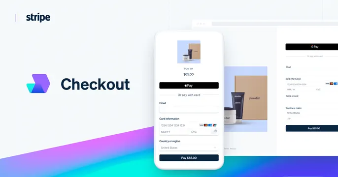
Light card with the Stripe Checkout product logo and name at left and layered checkout UI screens on a phone and desktop at right.
Summary
A clean split card: the Stripe wordmark with a gradient "Checkout" product mark and label on the left, and overlapping checkout UI, a phone payment screen layered over a desktop form, on the right.
Visual description
White background. Top-left shows the small "stripe" wordmark; below it a colorful gradient product glyph sits beside "Checkout" in dark navy. The right side layers product screenshots: a phone mockup in front shows a checkout sheet (product thumbnail, "$65.00", an Apple Pay button, email and card fields, "Pay $65.00"), partially overlapping a desktop checkout form behind it and a product photo card. A blue-to-purple gradient blooms from the lower edge behind the phone. Cool, clean, product-forward.
Key takeaway
Overlapping a phone checkout sheet in front of a desktop form shows responsive coverage in one glance. The gradient bleeding up from the bottom edge adds depth and ties the product glyph color into the scene.
Reuse notes
Standard product-feature OG layout: name and icon left, layered UI right. Best when the UI is clean and the hero flow is recognizable. The corner gradient is an easy way to add brand color to an otherwise white card.