Preview image. Unlock full-res
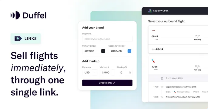
White card with the Duffel logo, a "LINKS" badge and the italic-accented headline "Sell flights immediately, through one single link," beside branding and flight-results UI cards.
Summary
A white card for Duffel Links: logo, a "LINKS" feature badge and a headline mixing roman and italic, "Sell flights immediately, through one single link," set beside two stacked product UI cards.
Visual description
Clean white background. The left half stacks the Duffel logo and wordmark, a teal-tinted "LINKS" pill badge with a lightning icon, and a large near-black headline where "immediately" is set in italic for emphasis among the roman words. The right half overlaps two white UI cards: a foreground "Add your brand" panel with logo-URL, primary and secondary color swatches (#22222C, #BBD4FB), markup fields and a dark "Create link" button, and behind it a "Loyalty Geek" flight-results card listing outbound flights with times, prices and airline marks. The cards bleed off the right edge.
Key takeaway
A small feature badge above the headline names the specific product being promoted, useful when one brand ships many OG cards. Italicizing a single word inside an otherwise roman headline is an understated emphasis trick.
Reuse notes
Best for a SaaS promoting a named sub-feature, where the badge plus a focused UI sample do the explaining. Overlapping two cards shows both setup and output. Keep the field white so the layered UI stays legible.