Preview image. Unlock full-res
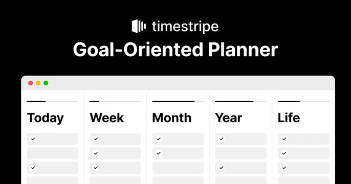
Dark card with a centered logo and headline above a cropped light product screenshot of a multi-horizon planner.
Summary
A product card that stacks a black header zone over a bright app screenshot, leading with the oversized claim "Goal-Oriented Planner." The defining move is the hard contrast between a black type band and a white macOS-style window peeking up from the bottom.
Visual description
The top half is solid black, carrying a small white logo glyph plus "timestripe" wordmark, then a large bold white headline "Goal-Oriented Planner." The bottom half is a light product screenshot of the app, framed in a rounded macOS window with red/yellow/green traffic-light dots. Inside, five labeled columns read "Today, Week, Month, Year, Life," each holding a stack of checkbox rows, illustrating the multi-horizon planning concept. The window is cropped so only its top region shows.
Key takeaway
The split between a black messaging band and a real product screenshot lets the headline state the value while the UI proves it. Cropping the app window to a peek (just the header and first rows) implies more depth without showing a full cluttered screen.
Reuse notes
A reliable pattern for productivity and SaaS tools that want copy plus proof in one card. Needs a clean, legible screenshot whose first visible rows already communicate the product. The labeled-columns crop works especially well for any tool with a clear horizontal structure.