Preview image. Unlock full-res
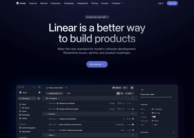
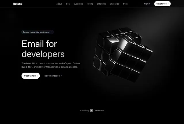
Dark developer-tool hero with a left-aligned oversized headline above a large tilted, dimly-lit screenshot of the Linear app.
Summary
A dark, left-aligned developer-tool hero leading with an oversized two-line headline and a single primary CTA, anchored by a large dimly-lit, tilted screenshot of the product.
Visual description
A dark top bar carries the Linear logo and wordmark left, Features/Method/Customers/Changelog/Pricing/Company/Contact center, and "Log in" plus a white "Sign up" button right. Below, left-aligned, a huge white two-line headline "Linear is a purpose-built tool for planning and building products", a two-line grey subhead, then a white "Start building" button beside an "Introducing Customer Requests" text link with a chevron. The lower two-thirds is filled by a large product screenshot tilted in perspective and fading into the black background: a dark app with a left sidebar (Inbox, My Issues, Workspace, Initiatives, Projects, Views, Teams) and an issues list with status icons, code-comment annotations floating to the right. The image is deliberately dim so the headline keeps focus.
Key takeaway
Dimming and tilting the product screenshot so it recedes into the background lets a busy, text-dense app sit under a hero without competing with the headline. Pairing one solid button with a plain text link keeps the CTA area quiet and premium.
Reuse notes
The reference dark-hero pattern for a developer or planning tool. Works only on dark, and depends on a screenshot rich enough to imply depth when faded. The single-CTA-plus-link approach suits products whose users self-serve. Keep the headline left-aligned to balance the tilted image.