Preview image. Unlock full-res
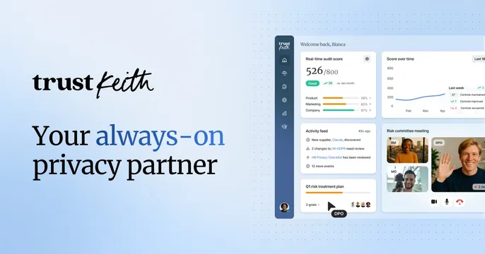
Light-blue OG card with a mixed serif-and-script wordmark, a left headline with a blue accent word, and a detailed privacy dashboard on the right.
Summary
A soft-blue OG card splitting a left serif headline (one word in blue) against a rich privacy-compliance dashboard on the right. The defining move is the two-tone "trust" serif plus "keith" script wordmark.
Visual description
Pale blue gradient background with a faint dotted texture on the right. Left side shows the "trust keith" wordmark, "trust" in a bold serif and "keith" in a handwritten script, above a large headline "Your always-on privacy partner" where "always-on" is set in blue. The right two-thirds is a detailed light-mode dashboard: a left icon rail, a "Welcome back, Bianca" header, cards for a 526/800 real-time audit score with progress bars, a "Score over time" line chart, an activity feed, a Q1 risk treatment plan, and a "Risk committee meeting" panel with video-call participant tiles.
Key takeaway
Pairing a serious serif with a casual script in the same wordmark softens a compliance product's tone. A single blue accent word ties the headline to the brand color, and a genuinely detailed dashboard signals a mature, feature-rich tool.
Reuse notes
Good for a GRC, privacy, or security SaaS that needs to look both approachable and credible. The dashboard must be legible enough to imply depth without being readable in full. Works best on a light, low-saturation ground.