Preview image. Unlock full-res
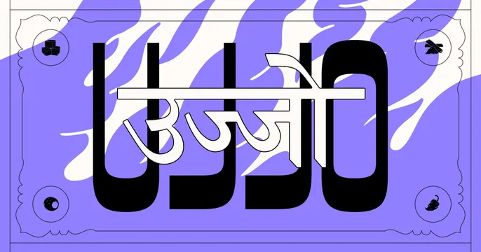
Bold display "UJJO" wordmark overlaid with a white Devanagari script, framed by an ornate border on a purple-and-cream wavy ground.
Summary
A maximalist centered card layering a huge black "UJJO" Latin wordmark with a white Devanagari version of the name across it, set inside an ornate ticket-style border over a purple-and-cream wavy background.
Visual description
A bold violet background is overlaid with organic cream-colored wavy ribbons that flow horizontally like marbling. Centered is the brand name set twice: very large black all-caps "UJJO" in a rounded, heavy display face, with a flowing white Devanagari script of the same name struck through the middle, the two scripts interlocking. Surrounding everything is a decorative scalloped, double-ruled border reminiscent of a banknote or ticket, with four small line-icon medallions in the corners (including what look like sugar cubes, a chili, and crossed implements). The look is dense, ornamental, and culturally specific.
Key takeaway
Stacking a Latin display wordmark and a native-script rendering of the same name so they interlock as one graphic, celebrating bilingual identity. The banknote/ticket border with corner medallions adds craft and a collectible, heritage feel.
Reuse notes
Suited to a food, cultural, or consumer brand rooted in Indian (or other Devanagari-script) identity that wants to lead with heritage and personality. The ornamentation is busy, so it works best when the wordmark stays dominant. Reads strongly on saturated colored backgrounds; the layered scripts need a large render to stay legible.