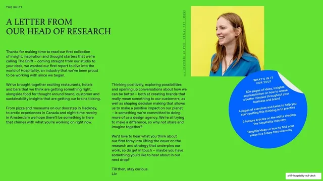
Preview image. Unlock full-res
A 16-slide editorial thought-leadership report on hospitality and sustainable branding, built on saturated cobalt-blue, lime-green and lilac fields with oversized serif section dividers and magazine-style collage spreads.
Summary
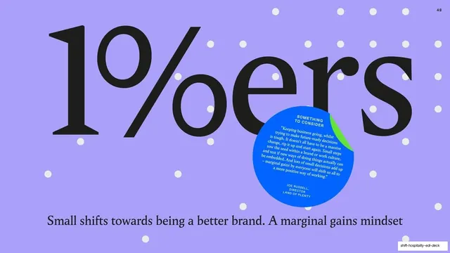
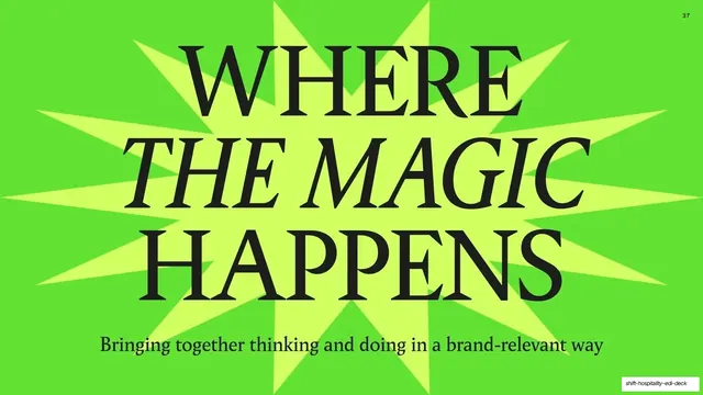
A 16-slide editorial report titled "The Shift," produced by the studio Land of Plenty about hospitality, brand and sustainability. Its personality comes from a loud color system (cobalt blue, lime green, periwinkle, near-black) and a recurring move where an oversized serif section title is squeezed inside a single graphic shape that fills the whole frame.
Visual description
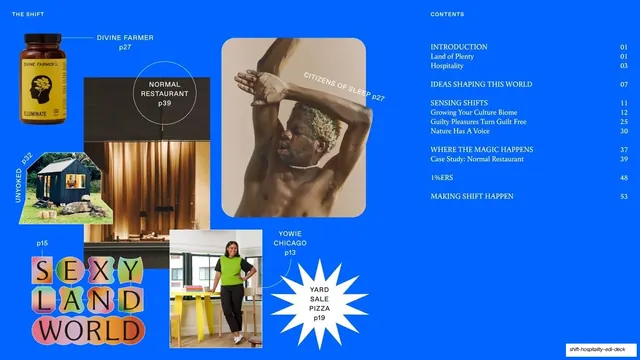
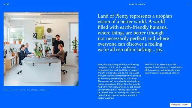
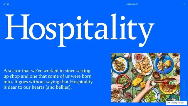
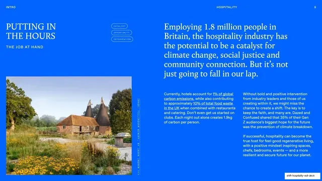
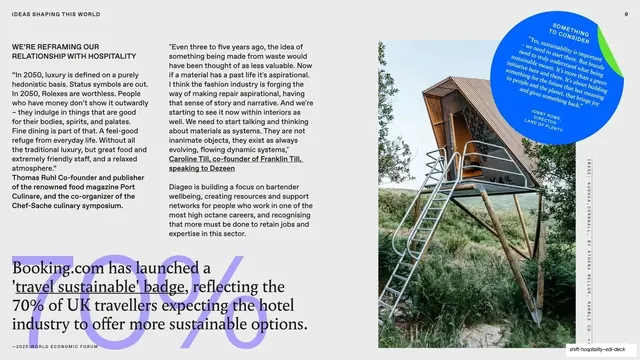
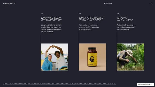
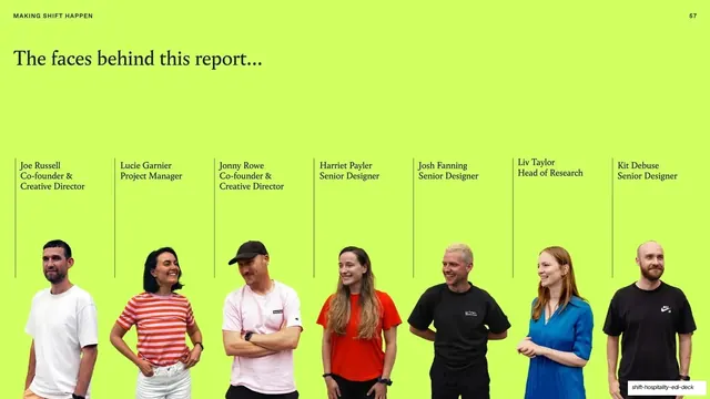
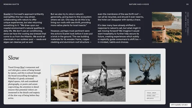
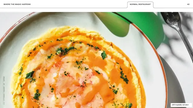
Slides run 16:9 and alternate between two registers. Content spreads sit on a saturated cobalt-blue (#1A6BFF) field with white knockout text, magazine-style running headers (section label left, topic center, page number right, all in tiny monospace all-caps), and vertical rotated image credits running up the right edge. These spreads use editorial multi-column body copy, framed documentary photography, collage moodboards, and circular pull-quote "stickers." Between them sit full-bleed section dividers in a different palette each time (lilac #A8A2F2, lime #7DDB2A, near-black #1E1F26), where a huge title in a high-contrast serif is forced into a single container shape: a squircle-W, a rounded blob, a starburst, an explosion. Typography mixes three voices: a refined serif (Times-like) for the giant titles and body, a heavier geometric sans for some statement slides, and a monospace for all the small utility labels and credits. Recurring components include a three-column numbered overview (01/02/03 with italic headings, short body and a small photo), a green team row with cut-out portraits on hairline-divided columns, circular blue "something to consider" quote badges, and a contact closing slide. The cover and section openers favor maximal type scale; the interior spreads stay disciplined and grid-led.
Key takeaway
The strongest idea is constraining each oversized section title inside one bold container shape (squircle, blob, starburst) so the divider reads as a single graphic event rather than just big text. Also worth taking: the consistent magazine chrome (mono running header, rotated edge credits, page numbers) that makes a slide deck feel like a printed report, and the discipline of pairing one refined serif with a monospace utility voice across every slide.
Reuse notes
A strong reference for brand reports, trend reports, thought-leadership PDFs, and any agency or studio deck that wants an editorial-magazine feel rather than a corporate template. The container-shape divider system is directly reusable as section breaks in a long document. It leans hard on a saturated three-to-four color palette and good documentary photography, so it needs both to work; the loud color is committal and not suited to muted or conservative brands. Note the gallery's source captions describe this as a hospitality EDI software platform, which the slides do not support; treat those captions with caution.
From this deck: The Shift Hospitality EDI Deck 2024
View deck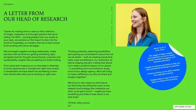


More like this






Keep what you find
A free account saves references to boards and can send you a weekly email of picks based on what you save.
To see every result, go Pro.