Preview image. Unlock full-res
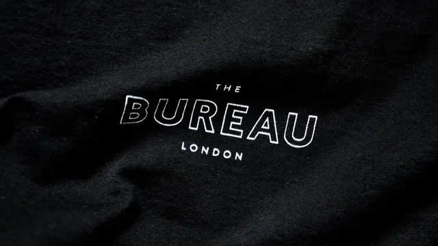
A minimalist dark title card showing "THE BUREAU" and "LONDON" in outlined sans-serif type on a textured black background.
Summary
A minimal title card for The Bureau, a London-based film company, rendered in outlined sans-serif type on a dark textured background.
Visual description
The composition is nearly black, with a rich textured surface suggesting fabric or stone. Two lines of white outlined sans-serif type appear centered: "THE BUREAU" in larger letters with a hollow/outlined stroke, and below it "LONDON" in a smaller, solid sans-serif. The letters are crisp and geometric. The dark background subtly shifts and fades, creating depth without drawing attention away from the typography.
Key takeaway
Extreme restraint in service of clarity: a monochrome palette and single centered element make the brand name unmissable. The outlined type is playful yet professional, balancing approachability with authority.
Reuse notes
Effective template for entertainment or creative-industry branding. The dark background and outlined type work well in film, music, and design contexts. The London locality adds geographic specificity without visual clutter. Pairs well with movement or animation overlays.
More like this

Keep what you find
A free account saves references to boards and can send you a weekly email of picks based on what you save.
To see every result, go Pro.