Preview image. Unlock full-res
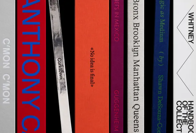
A row of book spines featuring bold typography and a warm color palette of red, orange, burgundy, navy, and gray.
Summary
A carefully curated collection of book spines arranged vertically, showcasing bold sans-serif typography in warm and cool tones against a muted backdrop.
Visual description
Five book spines lean against a light background. From left to right: a red spine with large blue capital letters "NOHTYP"; a narrow grayscale or off-white spine with small text; an orange spine with brown serif text reading "Corktown Family"; a deep burgundy spine with small serif text; a white or cream spine with black text reading "300% Brookyn Midagttan Queens"; a dark navy spine with smaller text; and a white spine on the far right with a zigzag edge detail and text reading "WHITNEY" and "HAND... THE COLLECTION". The color palette moves from warm reds and oranges to cool blues and neutrals.
Key takeaway
The spine arrangement creates a strong visual rhythm through color and typography variation. The mix of serif and sans-serif treatments, combined with all-caps and mixed-case lettering, shows how typographic hierarchy can make a unified collection feel both cohesive and dynamic. The warm-to-cool color transition guides the eye naturally across the composition.
Reuse notes
Strong for editorial or publishing design presentations. Works well as a mood-board reference for book design, library aesthetics, or typography systems where spine visibility is critical. The color progression (warm through cool) is reusable for palette exploration. Best showcased as a detail or close-up rather than full spreads.
More like this






Keep what you find
A free account saves references to boards and can send you a weekly email of picks based on what you save.
To see every result, go Pro.