Preview image. Unlock full-res
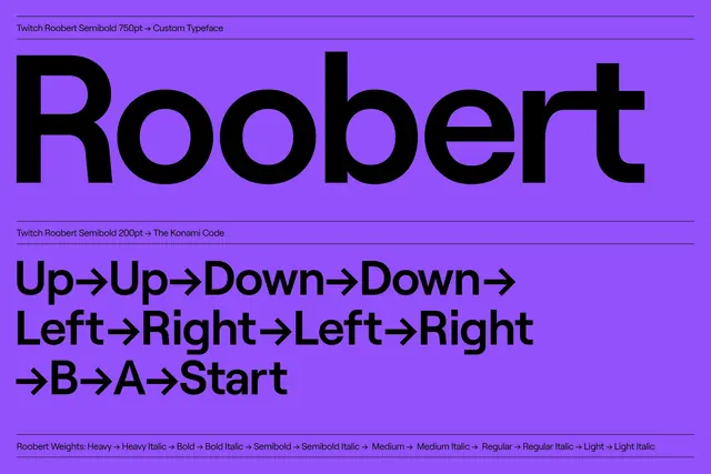
Vibrant purple background displaying the "Roobert" typeface in large black letters alongside gaming control commands (arrow keys, buttons), showcasing font weights and applications.
Summary
A typeface specimen for Roobert displayed on a saturated purple background, showing the large display letterform and a gaming command sequence below, with font weight variations listed at the base.
Visual description
The composition fills a wide landscape frame entirely with a vibrant, saturated purple background. Near the top, small text reads "Twitch Roobert Semibold 750pt → Custom Typeface" and similar designation lines. The dominant feature is the word "Roobert" rendered in enormous black sans-serif letters, perfectly centered, with a friendly, rounded stroke weight. Below, a secondary line displays gaming terminology in the same typeface: "Up→Up→Down→Down→ Left→Right→Left→Right→B→A→Start" (recognizable as the classic "Konami Code"). At the very bottom, a longer line catalogs the font's weight spectrum: "Roobert Weights: Heavy → Heavy Italic → Bold → Bold Italic → Semibold → Semibold Italic → Medium → Medium Italic → Regular → Regular Italic → Light → Light Italic". All type is rendered in black, creating maximum contrast against the purple field.
Key takeaway
A well-designed typeface specimen balances the hero display (large, immersive) with practical information (weights, applications) without overwhelming visual hierarchy. Choosing a thematic application (gaming controls) rather than generic "Lorem ipsum" text makes the specimen memorable and contextually relevant.
Reuse notes
Reference for typography specimens, typeface presentations, or brand guidelines. The gaming connection gives this broader appeal beyond traditional editorial. The purple-and-black pairing is bold and contemporary—highly re-memorable. Use this approach for tech, gaming, streaming, or creative industry brand presentations. The display of multiple weights in a single line is a clean, compact way to show typeface versatility. Works well for slide presentations, brand decks, or portfolio pieces showcasing type design.
More like this



Keep what you find
A free account saves references to boards and can send you a weekly email of picks based on what you save.
To see every result, go Pro.