Preview image. Unlock full-res
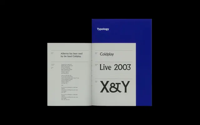
An open-book typographic study showing Albertus typeface information on left page and "Coldplay Live 2003 X&Y" title composition on right, with deep blue folder accent.
Summary
A typographic educational spread presenting typeface information and band/album branding, anchored by a deep navy blue folder creating structural color blocking.
Visual description
An open book or pamphlet is photographed flat against a dark background. The left cream page contains detailed text about "Albertus" typeface and its usage history. The right page displays large display type reading "Coldplay Live 2003 X&Y" in heavy serif and sans-serif faces. Behind and to the right sits a deep indigo-navy folder marked "Typology," creating a strong color accent and visual weight. The typography itself is the primary subject—hierarchy, scale, and typeface combinations are carefully balanced. The cream paper creates contrast against both the black background and the deep blue folder.
Key takeaway
How a single bold accent color (deep navy) can anchor and elevate a typographic composition. The layering of book, folder, and background creates dimension in a flat medium.
Reuse notes
Ideal reference for typography-focused design, educational materials, and print design that needs to convey both technical information and visual sophistication. The approach of using a bold color block to organize and frame information is widely applicable. The monochromatic type-on-cream reads as timeless and professional.
More like this







Keep what you find
A free account saves references to boards and can send you a weekly email of picks based on what you save.
To see every result, go Pro.