Preview image. Unlock full-res
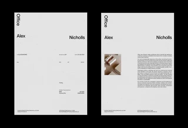
Architecture studio branding package with business cards and portfolio pages, using a warm neutral palette of tan, mauve, and blue-gray.
Summary
Branding identity for an architectural practice with business cards and portfolio layouts, introducing warm earth tones and photography into a minimalist typographic system.
Visual description
Left page shows studio name and branding in small sans serif with warm-toned photography of an architectural model (shelving or storage unit in natural materials). Right page contains body copy describing the practice's philosophy, with a secondary product photograph of the same or related work. Color palette mixes warm tans and mauve with cooler gray-blue accents. Typography remains minimal and justified; photography is tightly cropped and naturalistic.
Key takeaway
Warm color palette in a minimal context feels sophisticated rather than corporate. Pairing text-heavy pages with photo-light pages creates visual rhythm. Two photographs of related work can establish consistency without repetition.
Reuse notes
Good reference for studio or practice identities that need to balance personality (warm palette) with professionalism (minimal layout). Works when you have compelling product or architectural photography. Scale down for postcards, or scale up for proposals and reports.
More like this


Keep what you find
A free account saves references to boards and can send you a weekly email of picks based on what you save.
To see every result, go Pro.