Preview image. Unlock full-res
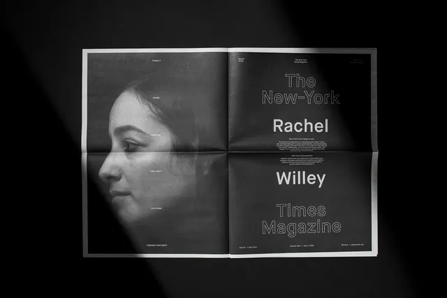
Magazine spread pairing a black-and-white profile portrait with text introduction for a feature article, using monochromatic editorial layout.
Summary
Magazine feature spread combining a tightly cropped profile photograph with typographic introduction, presented in a stark monochromatic palette.
Visual description
Left-facing page shows a large black-and-white profile photograph of a person, cropped close to show facial features and lighting detail. Right page introduces article with large serif headline reading "The New-York Rachel Willey Times Magazine" split across multiple lines, with smaller sans-serif body copy below. Entire composition uses black, white, and gray tones. Layout is symmetrical with the portrait balancing the text block. All typography is justified or centered, maintaining a formal editorial aesthetic.
Key takeaway
Pairing a strong photographic portrait with typographic introduction creates immediate editorial presence. Monochromatic approach lets both photograph quality and type hierarchy breathe. Splitting a title across lines adds personality to formal serif typography.
Reuse notes
Strong template for magazine editorial, annual reports, or corporate communications featuring a person. Works best with compelling portrait photography. The serif-and-sans mixture is a classic editorial move that signals authority while remaining modern. Consider this approach for feature stories, team introductions, or leadership profiles.
More like this









Keep what you find
A free account saves references to boards and can send you a weekly email of picks based on what you save.
To see every result, go Pro.