Preview image. Unlock full-res
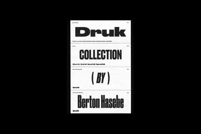
A photography of printed type specimen cards showing Druk typeface in multiple weights and styles.
Summary
A photography of printed specimen cards presenting Druk typeface in various weights, shot as a stack of white cards against a black background.
Visual description
Four white cards stacked and slightly offset, each displaying a different Druk font variant with size references. Bold black sans-serif letterforms dominate each card. Text includes weight specifications (Medium and Italic, Bold and Italic), taglines, and designer credits. The composition uses generous negative space and clean alignment typical of Swiss modernist design.
Key takeaway
The stacked-card format creates visual depth and hierarchy while showcasing font variations. The monochrome palette and generous spacing let the typeface be the sole design focus, a effective approach for type specimen documentation.
Reuse notes
Reference for typography-focused design materials, type specimen presentations, or modular card-based layouts. The format works well for showing weight/style progressions and is ideal for print collateral or packaging inserts.
More like this





Keep what you find
A free account saves references to boards and can send you a weekly email of picks based on what you save.
To see every result, go Pro.