Preview image. Unlock full-res
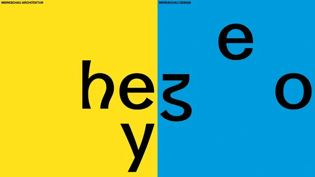
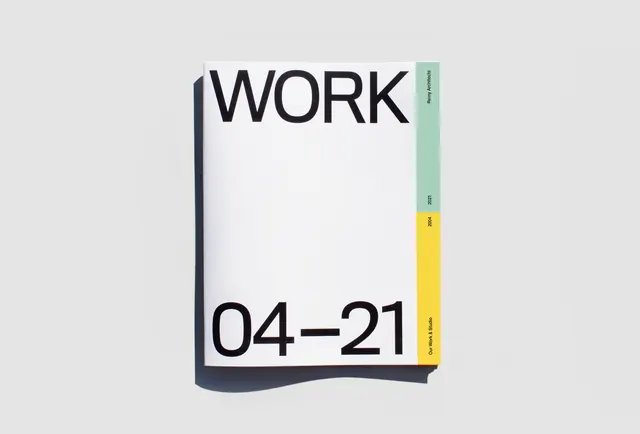
Split-screen typographic poster with bright yellow and teal halves, each labeled for architecture and design, featuring large black display type in a Swiss modernist style.
Summary
A dynamic split-screen typographic poster dividing bright yellow and teal halves, each with a institutional title label. The left side displays the letters "hey" in large black lowercase; the right displays "e" and "o" in black. Black sans-serif display type dominates flat color fields in a bold modernist composition.
Visual description
Perfect 50/50 vertical split with bright yellow left half and bright teal blue right half. Top of each half carries a label in small black sans-serif: "WERKSCHAU ARCHITEKTUR" (left) and "WERKSCHAU DESIGN" (right). Below, large black characters dominate each field, spaced for visual balance and hierarchy. The entire composition uses only three colors: yellow, teal, and black, creating a strong complementary color contrast on flat fields with no imagery or texture.
Key takeaway
The power of complementary color contrast and the restraint of limited typography to create visual impact. The split-screen format itself becomes the organizational principle, with type as the only content. Clean modernist approach to educational or institutional communication.
Reuse notes
Strong model for event posters, institutional identity, or educational graphics that need clarity and visual punch. Works well at large scale. The 50/50 split is instantly recognizable and memorable. Note: effective primarily in digital or print where the color saturation can be maintained; scale carefully for small applications.
More like this

Keep what you find
A free account saves references to boards and can send you a weekly email of picks based on what you save.
To see every result, go Pro.