Preview image. Unlock full-res
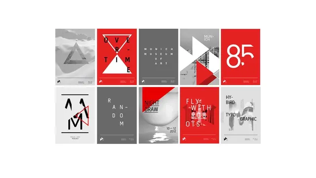
Grid presentation of ten museum poster designs sharing a strict red, grey, and white system of triangles, condensed all-caps type, and duotone winter photography.
Summary
Ten poster variants for a Munich art-museum program, shown as a two-row grid that proves how far a three-color system and one triangle motif can stretch.
Visual description
Two rows of five portrait posters on white. Every poster draws from the same kit: flat red, mid-grey, off-white, black accents, overlapping triangles, and greyscale photography (snowy landscapes, figure studies). Type is condensed sans-serif, all-caps, and deliberately broken across lines with hyphens ("OVE-TIME", "MUN-ICH", "FLY WITH ROB-OTS"); letters are spaced, stacked, or sliced by the triangle shapes. One poster is a giant "85" numeral on red; another stacks angular M letterforms. Each carries a small consistent footer with a triangular logo mark.
Key takeaway
A tight constraint set — three colors, one geometric motif, one type voice — generates ten clearly distinct posters that still read as one family. The aggressive hyphenated line breaks turn plain words into graphic shapes.
Reuse notes
Reference for exhibition and event identity systems, campaign families, and brand-guideline pages showing system flexibility. The broken-word typography trades legibility for impact, so reserve it for short titles; the red/grey palette suits cultural and institutional work.
More like this
Keep what you find
A free account saves references to boards and can send you a weekly email of picks based on what you save.
To see every result, go Pro.