Preview image. Unlock full-res
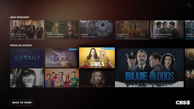
Dark streaming app interface showing two horizontal carousels of show tiles under "New Episodes" and "Popular Shows" sections.
Summary
A streaming app interface showcasing a browsable catalog organized into two horizontal carousel sections: New Episodes (featuring recent episode cards with show titles and season info) and Popular Shows (featuring larger promotional tiles with cast imagery and episode badges).
Visual description
Dark charcoal background with white typography. Two labeled sections stack vertically. The "New Episodes" carousel displays 5-6 horizontal show tiles with thumbnail images, titles, and episode/season numbers overlaid in smaller text. The "Popular Shows" section presents a grid of larger show cards with full artwork, blue "New Episode" badges, and prominent white text branding (Extant, 2 Broke Girls, The Big Bang Theory, Blue Bloods, Madam Secretary, The Good Wife, Under The Dome). A "Back to Home" button with outline styling appears at the bottom left; the CBS logo anchors the bottom right.
Key takeaway
The clear information hierarchy using two carousel layouts to separate discovery flows: quick browsing of new content vs. exploring popular titles. The generous use of whitespace and minimal contrast typography on dark improves scan-ability.
Reuse notes
Use this pattern for any content-discovery interface (streaming, e-commerce, content management). The dual-carousel approach balances editorial curation with algorithmic popularity. Note: works only on dark backgrounds; consider increased padding for mobile views where tap targets need separation.
More like this







Keep what you find
A free account saves references to boards and can send you a weekly email of picks based on what you save.
To see every result, go Pro.