Preview image. Unlock full-res
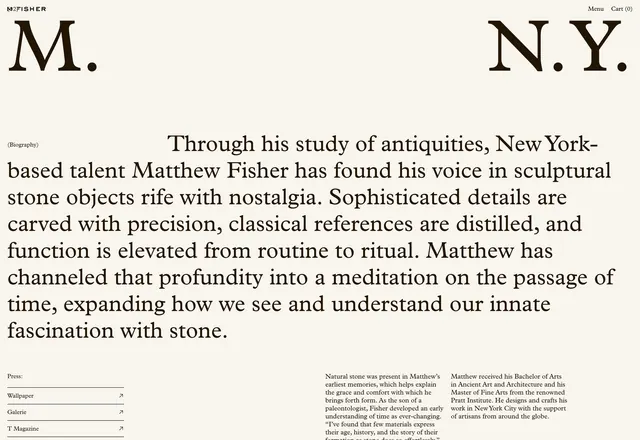
Website screenshot for M. Fisher, a New York stone sculptor, featuring large serif headline typography ("M." and "N.Y.") and a biography paragraph about the artist's sculptural practice on a cream-colored background.
Summary
The about/hero section of M. Fisher's portfolio website, featuring large serif typography ("M." on the left, "N.Y." on the right) with a substantial prose biography centered between them, all set on a warm cream background.
Visual description
A minimalist website layout on a cream or off-white background. The navigation bar "M FISHER" with menu and cart sits at the top. Large serif headlines in a classical typeface display "M." (left) and "N.Y." (right) at the page's top, visually framing the content below. Between and below these headlines, a justified paragraph in the same serif typeface provides a detailed biography of Matthew Fisher, describing his work as a stone sculptor and his artistic approach. Additional footer text includes "(Biography)" label and press links (Wallpaper, Galerie, T Magazine) at the bottom left. The composition balances whitespace with text, emphasizing typographic clarity and editorial restraint.
Key takeaway
Sophisticated use of large serif typography as primary visual element. The split-screen headline approach ("M." / "N.Y.") creates visual interest and establishes geographic identity without imagery. Generous whitespace and justified body copy convey premium positioning and craftsmanship.
Reuse notes
Strong reference for minimalist portfolio and artist websites, particularly those targeting luxury or high-craft positioning. Works well for architects, designers, sculptors, and other practitioners emphasizing thoughtful, conceptual work. The serif-heavy, type-centric approach suits clients with legacies or classical sensibilities. The cream background and justified typography pair effectively with fine-art or design-focused brands. The layout demonstrates that elegant, memorable design requires no imagery—only excellent typography and proportion.
More like this
Keep what you find
A free account saves references to boards and can send you a weekly email of picks based on what you save.
To see every result, go Pro.