Preview image. Unlock full-res
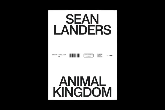
Minimalist book cover for "SEAN LANDERS ANIMAL KINGDOM" with bold black typography on white background, incorporating barcode and institutional logos at bottom.
Summary
A museum exhibition catalog cover featuring stacked sans-serif typography in pure black on white, with institutional metadata and logos structured at the base.
Visual description
A white background fills the majority of the space. Large bold black sans-serif text in multiple lines reads "SEAN LANDERS" across the top, with "ANIMAL KINGDOM" below in equally bold lettering. The hierarchy is created through line breaks and word positioning rather than size variation. At the bottom, a strip contains smaller text: ISBN number, barcode, and logos of museums or institutions (likely museum or arts foundation marks). No images, no color beyond pure black and white. Generous white space dominates. The composition follows a clear vertical structure with focal weight at top and supporting information below.
Key takeaway
The timeless authority of clean typography and white space. Institutional credibility through barcode and logo placement. The absence of imagery or color makes the typography itself the design statement.
Reuse notes
Strong reference for academic, museum, arts institution, or publishing design. Works across formats (catalogs, reports, posters) where credibility and sophistication matter. The monochrome palette is cost-effective for print. Bold sans-serif maintains readability at any scale. This approach is instantly recognizable as "high-design" or "institution-backed." Replicable with any serious sans-serif; adjust weight and spacing to match institutional personality.
More like this




Keep what you find
A free account saves references to boards and can send you a weekly email of picks based on what you save.
To see every result, go Pro.