Preview image. Unlock full-res
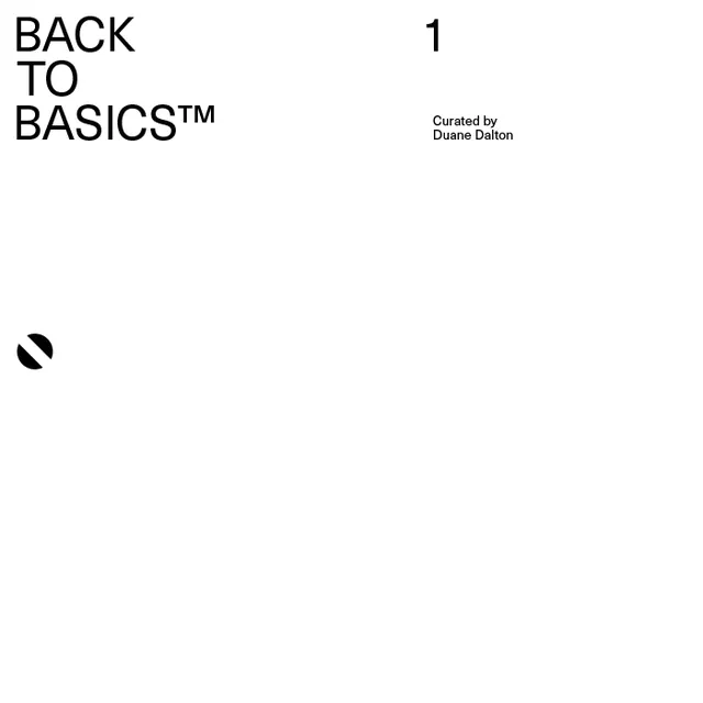
Clean, monochromatic design featuring bold black sans-serif text reading "BACK TO BASICS™" with a simple striped logo mark on white background.
Summary
A minimalist modernist design study in pure typography and geometric form, presenting bold sans-serif text with a clean striped mark on a white ground.
Visual description
Large, heavy black sans-serif lettering spells "BACK TO BASICS™" in all capital letters, positioned prominently on the left side of a white background. The trademark symbol is included. A small geometric mark—two concentric rounded rectangles or striped oval—sits below and to the right in solid black lines. The spacing is generous and deliberate. No additional color, photography, or illustration; pure typographic composition with negative white space dominating.
Key takeaway
The power of a single typeface, weight, and color to communicate confidence and clarity. The simple geometric mark provides brand distinction without complexity. Swiss modernism principles: grid-based, functional, timeless.
Reuse notes
Excellent reference for corporate branding, nonprofit identities, or any project requiring "trustworthy and clean" positioning. The heavy sans-serif and monochrome palette work across applications from digital to print. The simple striped mark is infinitely flexible—adapt the geometry to suit brand personality. This approach is timeless and works across sectors (finance, tech, culture, nonprofit). Replicable with any typeface; heavier weights maintain impact.
More like this


Keep what you find
A free account saves references to boards and can send you a weekly email of picks based on what you save.
To see every result, go Pro.