Preview image. Unlock full-res
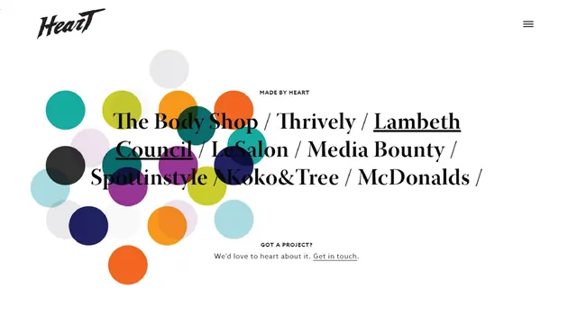
A web design showcasing a playful navigation system of overlapping colored circles adjacent to text listing partner brands and organizations.
Summary
A web page design featuring a collection of colorful circular shapes on the left side and a right-aligned text block. The design balances playful visual elements with organized content about partner organizations.
Visual description
The layout uses an asymmetric arrangement with a cluster of overlapping circles in various colors (teal, yellow, orange, navy, gray, purple, light blue) positioned on the left. These circles have varying opacity and overlap each other organically. To the right, sans-serif and serif typography lists partner names and an organization label ("MADE BY") with a call-to-action. The overall aesthetic is contemporary and friendly, with plenty of white space. Navigation icons appear in the top right corner.
Key takeaway
Using colorful, organic shapes as visual navigation or organizational elements rather than traditional UI patterns. This approach feels modern, accessible, and inviting while maintaining clarity through text hierarchy.
Reuse notes
Excellent for collaborative platforms, partnership showcases, or community-focused sites. The playful circle motif humanizes institutional or corporate content. Works well for nonprofits, creative collectives, or agencies emphasizing collaboration.