Preview image. Unlock full-res
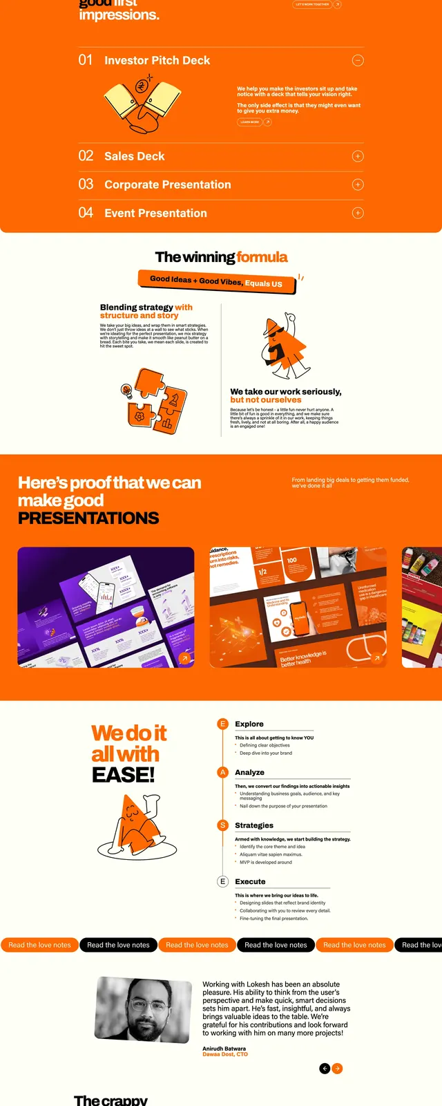
A playful presentation-agency landing page with a centered hero, vivid orange content bands, hand-drawn illustrations, and portfolio/testimonial/blog sections stacked down the page.
Summary
A playful presentation-agency landing page with a centered hero, vivid orange content bands, hand-drawn illustrations, and portfolio/testimonial/blog sections stacked down the page.
Visual description
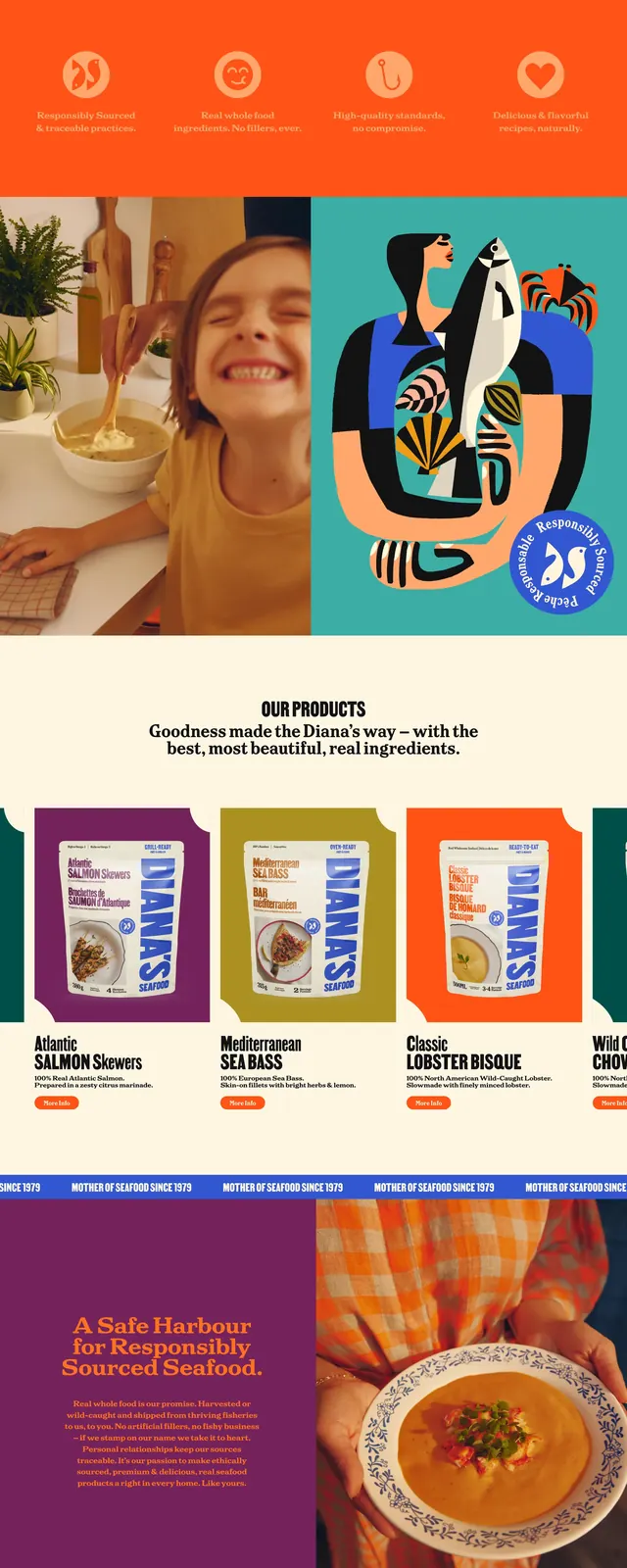
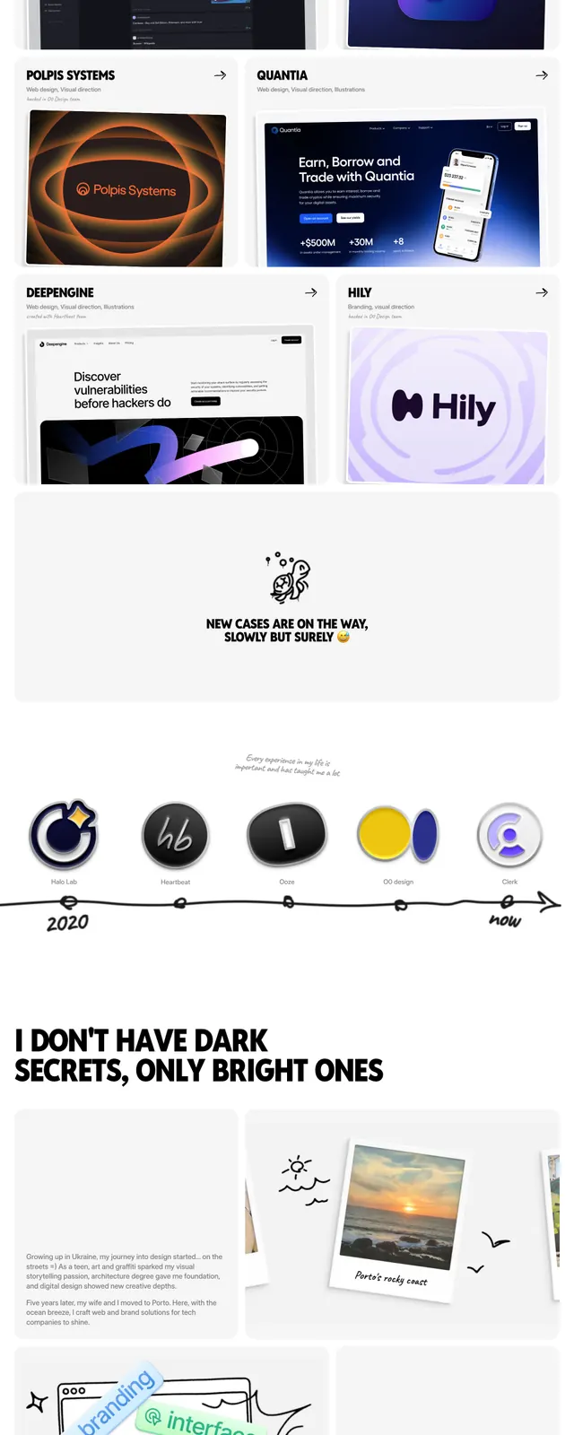
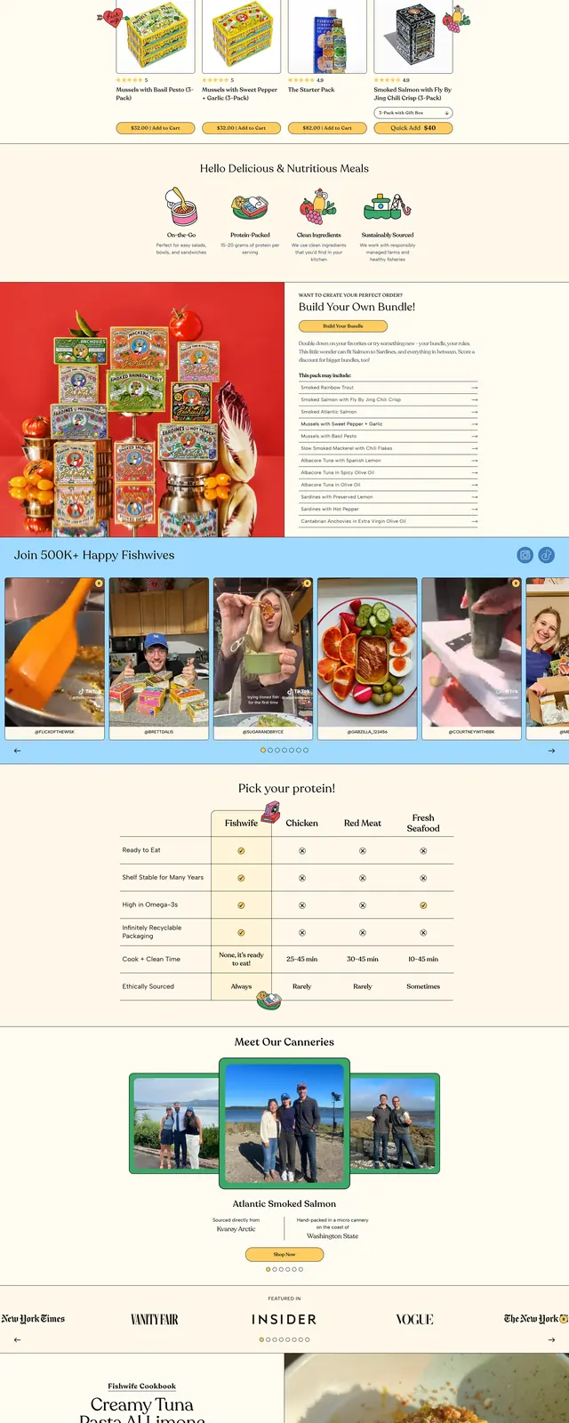
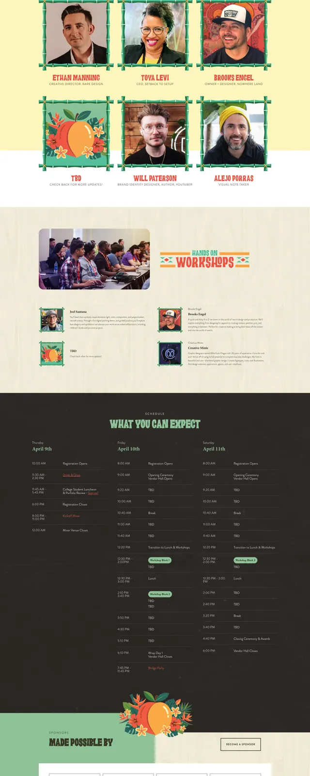
The page opens with a small logo and minimal top navigation, then a centered hero headline reading “Creating slides that speak for you” on a pale cream background. Large orange full-width bands break up the page below, mixing bold section headings, short body copy, and hand-drawn illustration assets. Further down, the layout shifts into a portfolio grid with large project thumbnails, a testimonial block with a portrait image, and a three-card blog list, all using rounded corners and generous spacing.
Key takeaway
The strongest move is the contrast between a very clean cream canvas and saturated orange sections, which gives the page a memorable, poster-like rhythm. The illustrated accents keep the brand approachable while the oversized type and portfolio imagery still make it feel like a serious presentation studio.
Reuse notes
Use this pattern for creative agencies, studios, or service brands that want a friendly, high-energy landing page without losing clarity. The structure works best when you have strong visual assets and short copy; it relies on illustration and color blocks to carry the personality.