
Preview image. Unlock full-res
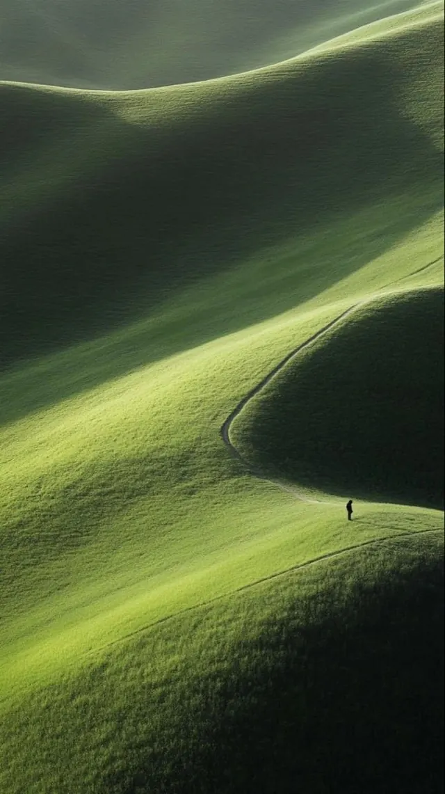
Photography or product image balancing deep charcoal grays with soft sage greens and muted ochres, creating a calm, nature-inspired palette with organic sophistication.
Summary
A large-format, nature-inspired color palette balancing cool and warm earthiness. Deep charcoal (#2A302F) grounds the composition, while a fresh sage green (#5DD490) provides life. Two earthy ochre-olive tones (#9E9067, #668758) create depth and organic harmony.
Visual description
Square-tall format (2000x2500px) suggests portrait orientation product or artistic photography. The palette draws from nature—charcoal soil, spring green, warm dried grass. Cool green sits among warm yellows and browns, creating liveliness without jarring contrast. The colors are all desaturated and muted, avoiding artificiality. Likely features natural materials, botanical elements, or carefully composed still life.
Key takeaway
Nature's color harmony balances cool and warm within a desaturated range. The cool green accents dark, warm tones without clashing—this is the secret to organic sophistication. One moment of saturated green against muted companions creates visual interest without overstatement.
Reuse notes
Ideal for sustainable brands, botanical products, wellness, eco-conscious design, and natural material showcases. The palette feels premium yet approachable. Works beautifully in packaging, editorial, and environmental design. Pairs well with natural textures (linen, kraft paper, raw wood). The colors work across print, digital, and retail environments without needing adjustment.
More like this



Keep what you find
A free account saves references to boards and can send you a weekly email of picks based on what you save.
To see every result, go Pro.