Preview image. Unlock full-res
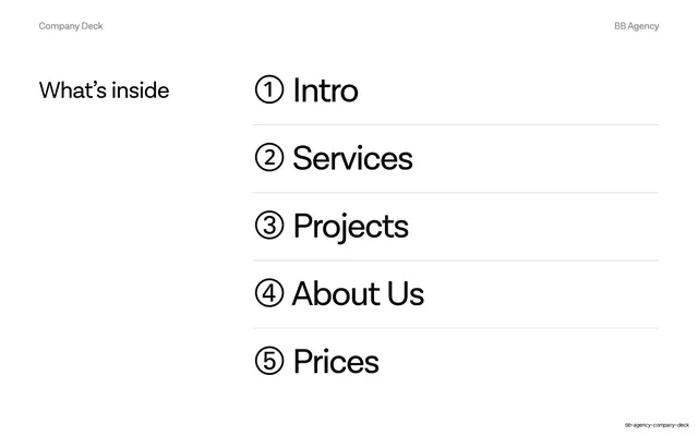
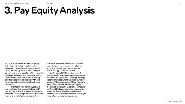
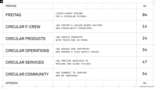
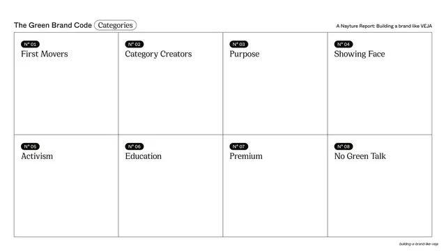
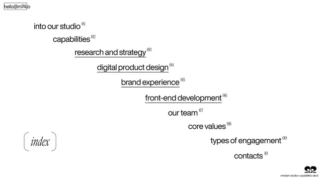
Table of contents set as a diagonal staircase of ten numbered items in black sans on white, with an italic "index" tag at lower-left.
Summary
The contents slide: ten section titles arranged as a descending diagonal staircase, each tagged with a small superscript number.
Visual description
Plain white background. The ten agenda items run top-left to bottom-right as a stepped staircase, each line indented a little further than the last: "into our studio", "capabilities", "research and strategy", "digital product design", "brand experience", "front-end development", "our team", "core values", "types of engagement", "contacts". Each is black lowercase grotesque sans with a small superscript number (01-10); the four design/build items are underlined. A small "hello@m74.io" sits top-left and an italic serif "index" tag in a bracket pill anchors the lower-left.
Key takeaway
Turning a plain table of contents into a diagonal staircase so the list itself becomes the composition, no rules or columns needed. Underlining only the clickable-feeling core services subtly ranks them within the list.
Reuse notes
A clean agenda or contents pattern for any text-only deck, and a nice way to make a long list feel designed. Works best with a short, punchy set of section names; a staircase of long phrases would collide. Pure type, so it carries no brand color on its own.