Preview image. Unlock full-res
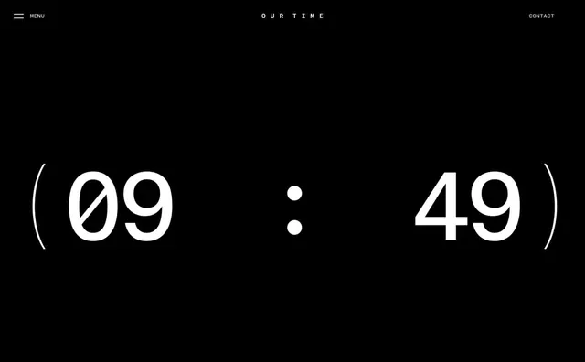
A stark, high-contrast UI design showing oversized numeric display (09:49) with minimal header navigation and time format indicator.
Summary
A minimalist digital interface featuring an oversized time display (09:49) with refined navigation, capturing restraint and clarity through extreme contrast and generous whitespace.
Visual description
A pure black background dominates the composition with white text and interface elements providing complete contrast. At the top, a hamburger menu icon sits on the left, centered text reads "OUR TIME" in uppercase sans-serif, and "CONTACT" appears right-aligned—all in light gray or white. The lower two-thirds of the screen showcases an enormous, serif-influenced time display reading "09 : 49" in white, with large circular parentheses framing the numbers on either side. The layout is rigidly vertical, with ample negative space between elements. The monochromatic palette and extreme contrast create a focal hierarchy that directs all attention to the central time display.
Key takeaway
The power of extreme contrast and generous whitespace in directing visual attention. Oversized typography and centered hierarchy create a meditative, intentional quality that elevates a utilitarian time display into an experiential interface.
Reuse notes
Ideal for contemporary app design, gallery or museum interfaces, or any context requiring a calm, contemplative interaction. Works well for meditation apps, analog clock displays, or time-tracking tools. The high contrast ensures legibility on any screen size and accessibility across vision needs. Pair with sans-serif body text and structured layouts to maintain the minimalist aesthetic.